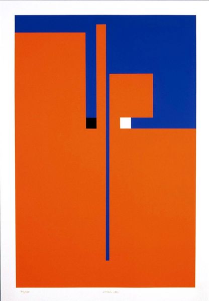
acrylic-paint
pop art
colour-field-painting
acrylic-paint
neo expressionist
acrylic on canvas
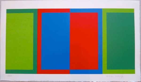
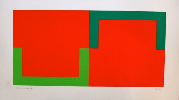
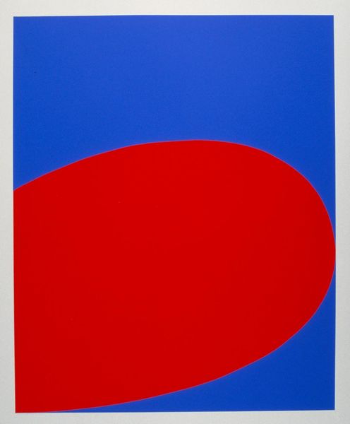
geometric
geometric-abstraction
abstraction
pop-art
line
orange
Copyright: Rubem Ludolf,Fair Use
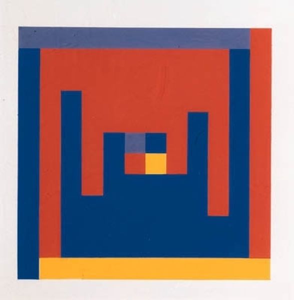
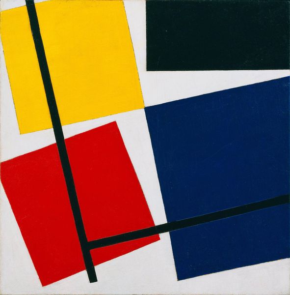
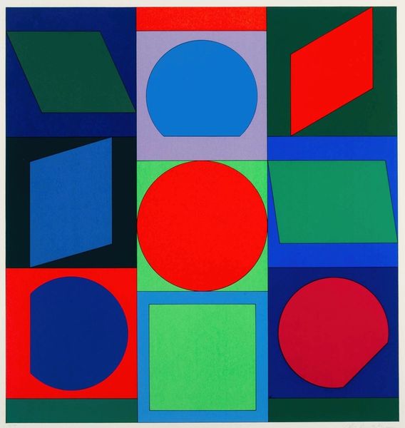
Curator: Here we have Rubem Ludolf's striking "Untitled" composition, rendered in acrylic on canvas. It's difficult to precisely date this piece, but the hard-edged forms and vibrant palette place it firmly within a milieu influenced by geometric abstraction and pop art. What strikes you first about this work? Editor: It's incredibly bold! The composition’s almost confrontational in its simplicity. Three blocks of unmodulated color: a sharp blue dominates, countered by a blazing red, and an assertive gold tone. Curator: Yes, precisely. Notice how the interlocking shapes play with positive and negative space. The artist's deployment of color creates visual tension, almost vibrating on the canvas. The geometry has an unsettling directness, disrupting the expectation of traditional perspective, especially the flatness, and absence of gradation, contributing to a powerful impact. Editor: The colors and shapes also put me in mind of commercial signs and graphic design. It almost feels like an abstraction of capitalist realism and consumerism. Did Ludolf intend to disrupt a conventional viewing experience? Curator: A productive thought! Though the artist leaves no concrete clues of their own intentions for this particular piece. From a formalist position, this work prioritizes an encounter between a viewer, the space, and the composition itself. The semiotic potential for broader commentary seems a secondary consideration here. Editor: That may be true but by using this imagery, can Ludolf really strip the commerciality of consumer culture from our reading of his work? These shapes are so evocative, I can't separate it from the bombardment of graphics we’re all subjected to, however minimalist or non-representational his process might have been. It does draw our eye like effective ads do, which makes me question our autonomy. Curator: Well, regardless of intentions, the piece serves as a powerful visual statement. What seems very clear is that the interplay of geometric structure and vibrant color is intentionally disruptive and thought-provoking. Editor: Absolutely! Whether critiquing culture or acting as a clean experiment on spatial relationship, there's an aggressive clarity at play that remains thoroughly interesting.
Comments
No comments
Be the first to comment and join the conversation on the ultimate creative platform.