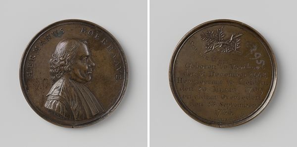
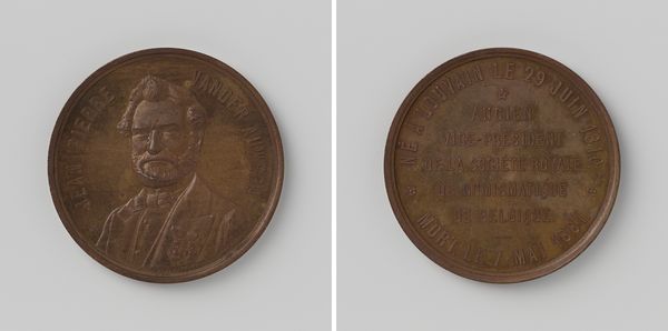
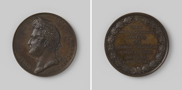
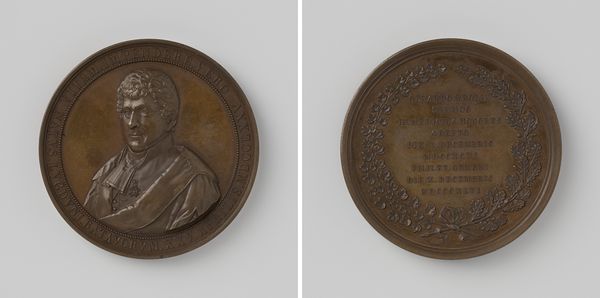
metal, relief, sculpture
portrait
baroque
metal
sculpture
relief
sculpture
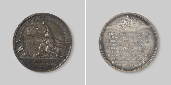
Dimensions: diameter 4.7 cm, weight 35.58 gr
Copyright: Rijks Museum: Open Domain
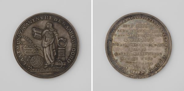
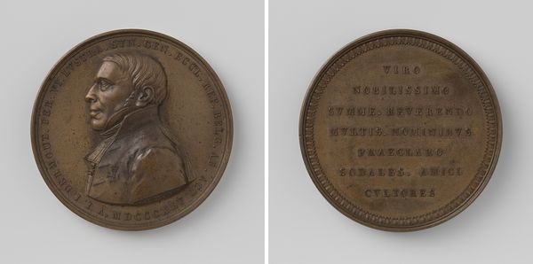
Curator: The work before us, created by Martin Holtzhey in 1740, is a commemorative medal celebrating the “Third Centenary of the Invention of Book Printing”. Editor: It's quite striking, isn't it? The portrait feels weighty, grounded. There's a solidity to it despite the scale. You can feel the texture, even through the glass or in reproduction. Curator: Absolutely. As a work of art, the medal showcases remarkable use of relief and space within the confines of the circular frame. Observe the contrast in textures; the smooth surfaces against the finely engraved details are captivating. Editor: This medal was not merely about aesthetics. These celebrations placed Laurens Janszoon Coster of Haarlem as the originator of printing with moveable type, effectively promoting the city of Haarlem, and sidelining Gutenberg's legacy. Curator: Precisely. Note how the composition is divided, portrait on one side, text on the other. The effigy has strong geometric and material relationships. We must read into what all these shapes represent, in addition to simply appreciating the artistic elements of baroque-styled metal. Editor: Right, and beyond aesthetics, it served a social function. Medals like these were given out and kept as political keepsakes to emphasize historical narrative. Curator: The inscription itself almost acts as an additional layer. It certainly is designed to be viewed not just as decoration. Its clear, Baroque lettering reinforces this concept. Editor: Considering its small size, the medal wielded a huge power. To create a version of historical record, spread the story in a manageable way, and impact societal understandings is certainly meaningful. Curator: The detail present across each plane reveals the hand of a highly skilled craftsperson, adept in bringing the inscription to life within such a demanding format. The balance and proportionality must have been hard to get right. Editor: The dialogue the artwork sparks is remarkable. Thinking about history, text, portraiture all converge on such a small format is truly wonderful to reflect upon.
Comments
No comments
Be the first to comment and join the conversation on the ultimate creative platform.