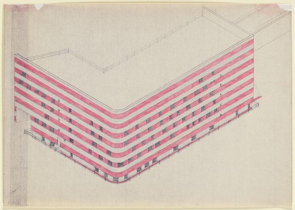
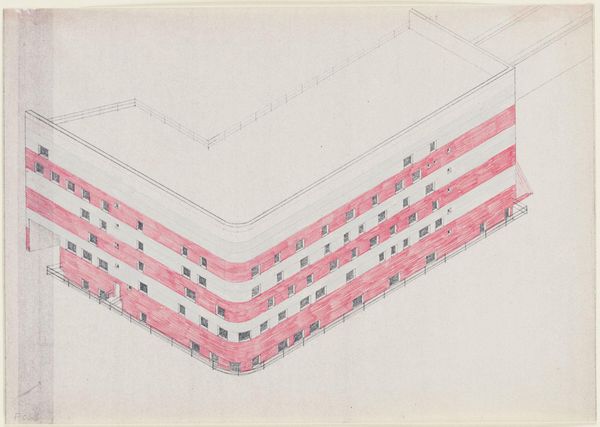
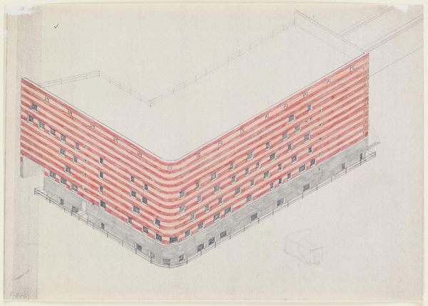
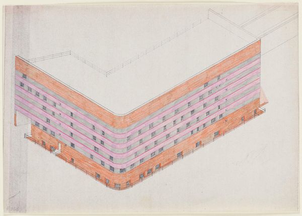
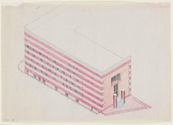
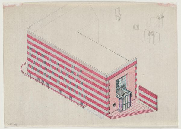
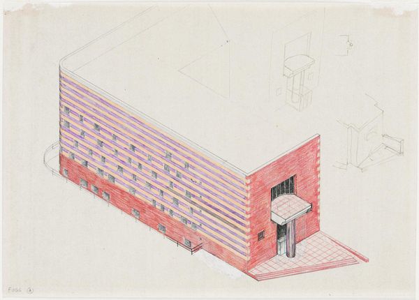
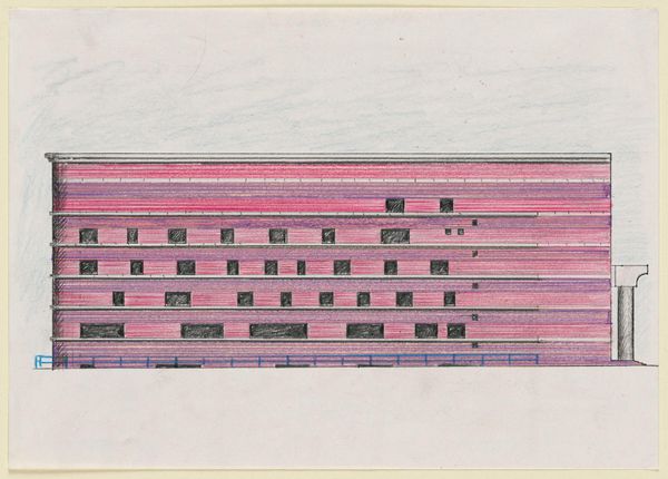
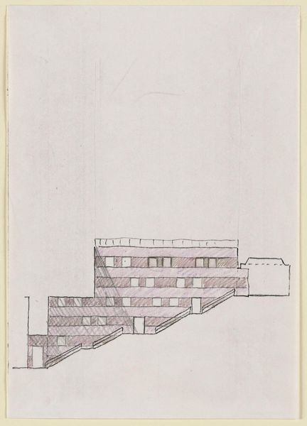
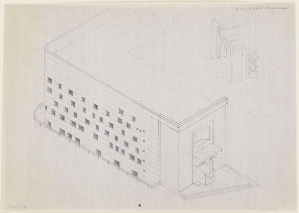
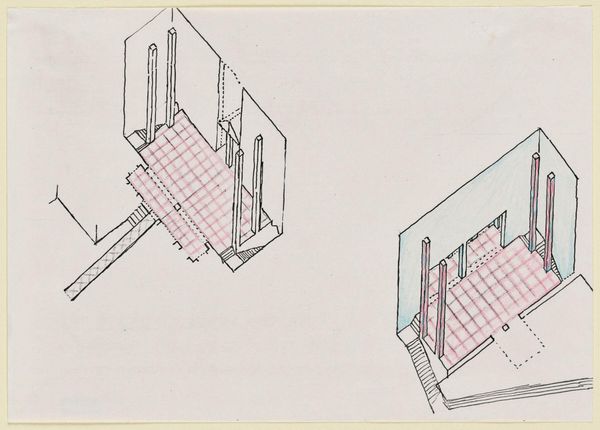
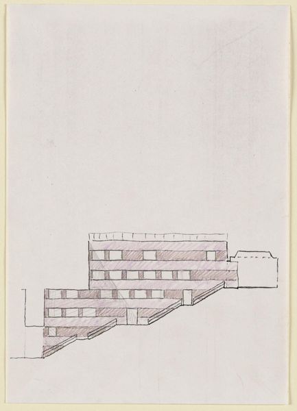
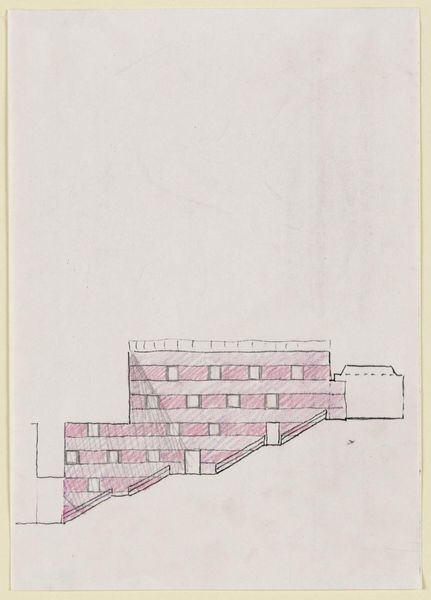
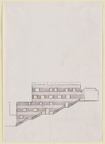
Drawing for the Arthur M. Sackler Museum, Axonometric Color Study for Cambridge and Quincy Street Elevations c. 20th century
Dimensions: 29.6 x 42 cm (11 5/8 x 16 9/16 in.)
Copyright: CC0 1.0
Curator: Here we have James Stirling’s "Drawing for the Arthur M. Sackler Museum, Axonometric Color Study for Cambridge and Quincy Street Elevations" from the Harvard Art Museums. Editor: Hmm, it feels a bit like a Wes Anderson film set, but… sterile. The pink stripes against the gray; there's something unsettling about it. Curator: I think Stirling is intentionally challenging our expectations of institutional architecture. The stripes could be read as a commentary on the rigid structures of power and knowledge within museums. Editor: Or maybe he just liked pink! Seriously, though, the drawing itself is so precise, almost obsessive. Curator: Consider the context—Cambridge, Harvard, a museum intended to house art from vastly different cultures and histories. Stirling’s design becomes a provocation about representation and authority. Editor: I get that. It's like he’s saying, "Here’s your ivory tower… but make it pink!" Makes you rethink the whole museum experience. Curator: Precisely. It compels us to question the values embedded within architectural spaces and the art they house. Editor: Well, I'll never look at a building the same way again. It's a deceptively playful piece.
Comments
No comments
Be the first to comment and join the conversation on the ultimate creative platform.