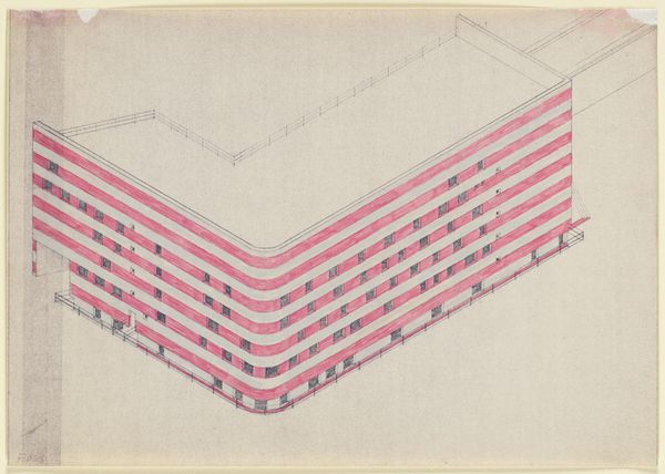
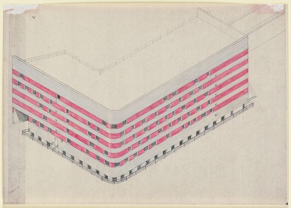
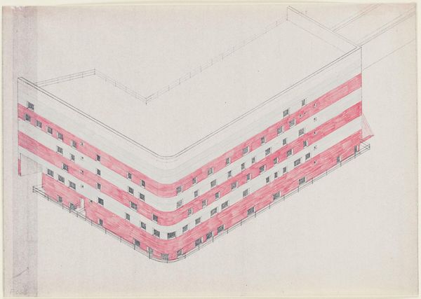
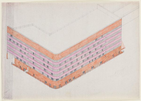
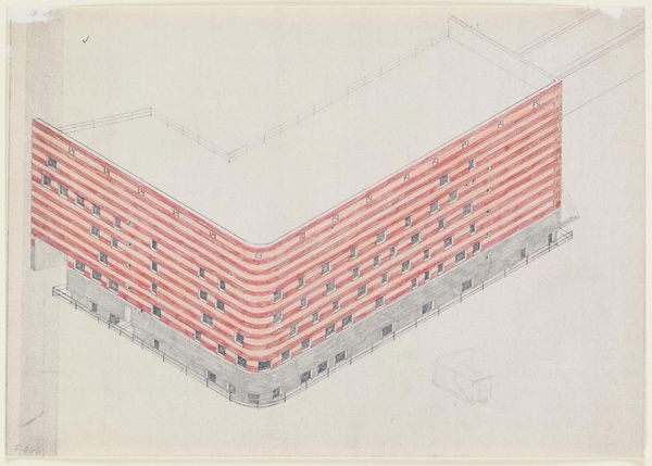
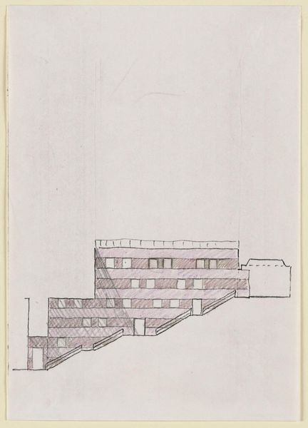
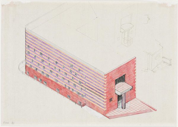
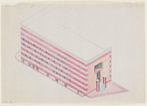
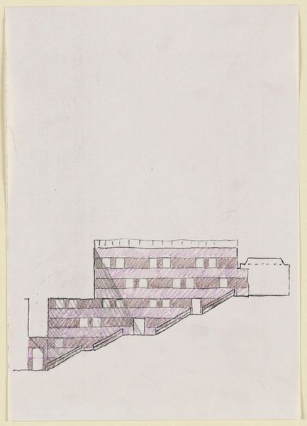
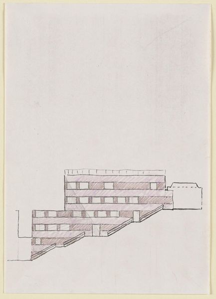
Drawing for the Arthur M. Sackler Museum, Color Study for Quincy Street Elevation c. 20th century
Dimensions: 21 x 29.7 cm (8 1/4 x 11 11/16 in.)
Copyright: CC0 1.0
Editor: So, here we have James Stirling's color study for the Arthur M. Sackler Museum. It's a colored pencil drawing, fairly small, and the pinks are so striking! What do you make of his color choices? Curator: The pink is a bit cheeky, isn't it? It's Stirling playfully grappling with classical forms. Do you see how the elevation almost mimics a temple facade, but then BAM! Hot pink! It's like he's saying, "Let's not take ourselves too seriously, folks." It's bold, and I think it was meant to provoke. Editor: I can see that. So it's almost a rejection of architectural norms? Curator: Exactly! He uses color to challenge expectations and inject a dose of personality into a very formal structure. Editor: That makes me appreciate the drawing even more! Curator: Me too. It's why I love art, to challenge our assumptions.
Comments
No comments
Be the first to comment and join the conversation on the ultimate creative platform.