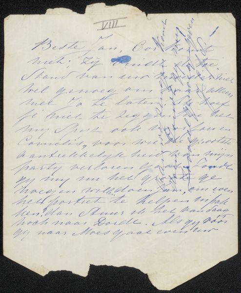
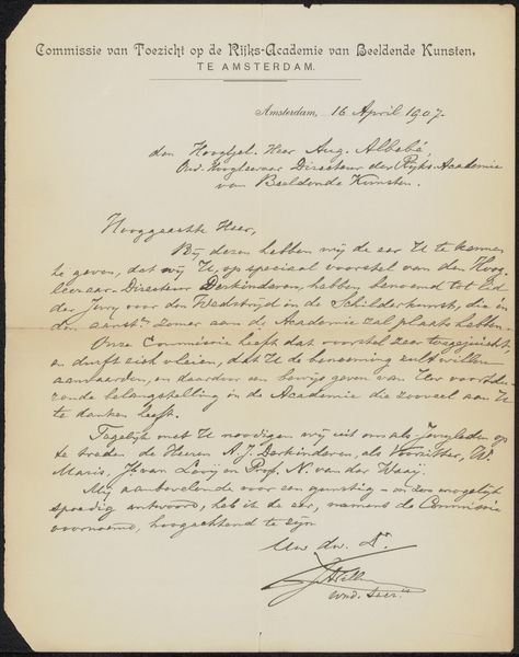
drawing, paper, ink
drawing
paper
ink
calligraphy
Copyright: Rijks Museum: Open Domain
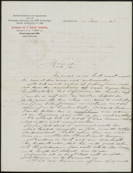
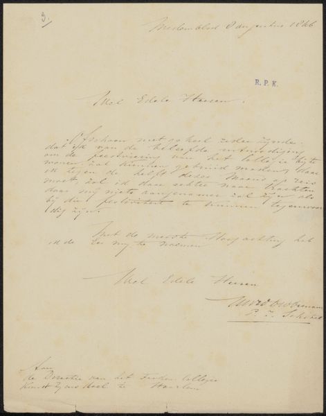
Curator: Here we have a drawing, “Brief aan Philip Zilcken,” potentially from 1918, created by Willem Nolen. It's ink on paper and exemplifies calligraphy. Editor: My first thought is elegance, but there's also something melancholic in its presentation. It reminds me of an older person trying their best to maintain formalities despite an era of crisis and destruction. I do find that script to be almost illegible. Curator: Note the deliberate composition. The lines of script are quite even; their visual rhythm speaks of calculated precision. There's a strong tension between control and freedom—calligraphy is the art of control via a freely expressive medium, of course. Editor: Right, control, but look at the date "29 April '18". The year resonates with the final year of the First World War, so this precise letter contrasts sharply with the chaos of the world outside its creation. Do you think that plays a role? Is this, in fact, not necessarily a letter, but a preservation of sanity for the letterer? Curator: It would be too on the nose to ascribe every piece of handwriting from that era solely to the war's influence, but I must concur—war almost certainly factors into the artist’s symbolic landscape here. In terms of visual semiotics, this is far more controlled than standard handwriting, therefore more formal—more intentional. The calligraphy imbues it with ritualistic qualities. Editor: I also think that this item speaks to resilience. The artist, in corresponding with another person—a physical object shared with intention—creates an almost intimate defiance of war's impersonality, right? Preserving, as it does, connection through meaningful symbol systems, in contrast to war's annihilation of meaning. Curator: Precisely. The inherent visual structure communicates a sense of resolution, with the strong base where it is signed by the artist creating a powerful formal anchor. Editor: So we see not just pretty penmanship here, but something far deeper— a tiny rebellion forged in ink and paper, a personal resistance expressed through refined symbolism and careful structure.
Comments
No comments
Be the first to comment and join the conversation on the ultimate creative platform.