drawing, paper, ink, pen
#
drawing
#
script typography
#
hand-lettering
#
ink paper printed
#
old engraving style
#
hand drawn type
#
hand lettering
#
paper
#
ink
#
hand-drawn typeface
#
pen-ink sketch
#
modern calligraphy
#
pen work
#
pen
#
calligraphy
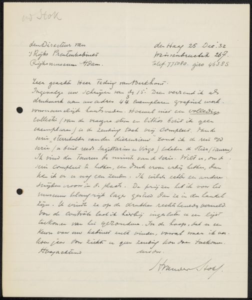
Copyright: Rijks Museum: Open Domain
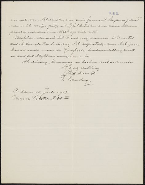
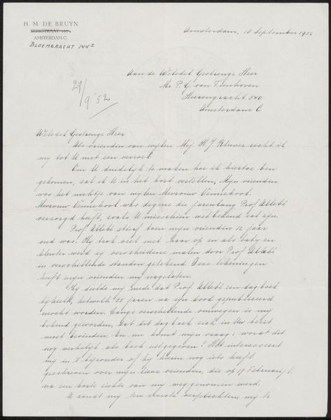
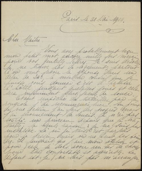
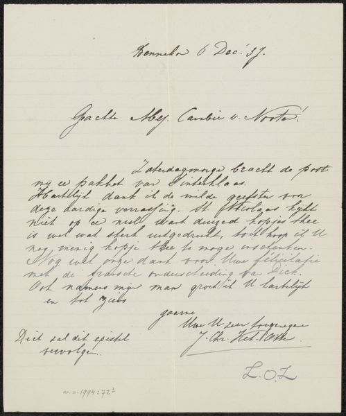
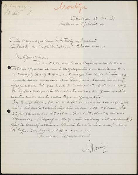
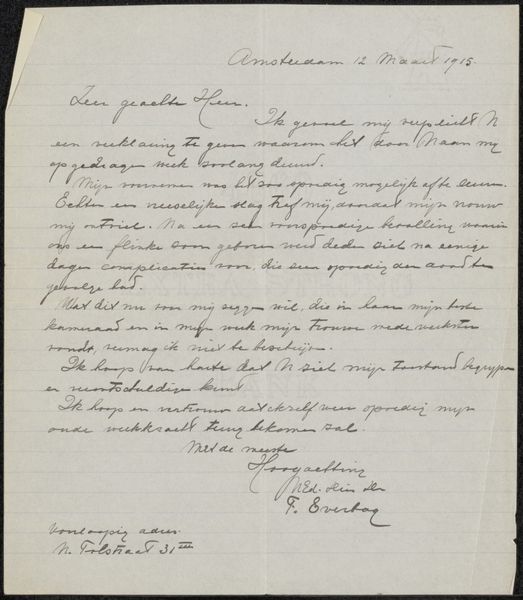
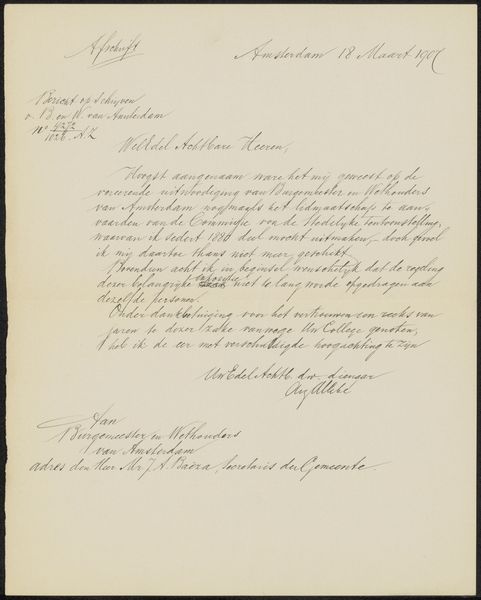
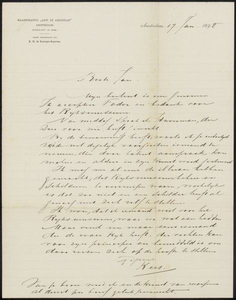
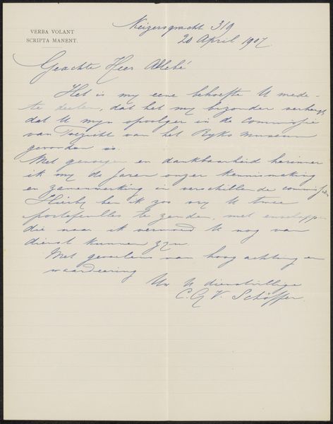
Curator: Alright, next up we have "Brief aan Philip Zilcken" which we believe dates from around 1929, crafted by Johan Marinus Schalekamp. It’s a letter done in pen and ink on paper, part of the Rijksmuseum's collection. What are your initial thoughts? Editor: Well, first impression is the sheer intimacy of it. The way the lines of script seem to almost whisper across the page. It feels very personal. Curator: Precisely. Schalekamp uses that beautiful, flowing calligraphy almost like a direct line to his thoughts. The use of script typography adds another layer. You know, a letter is not just about information; it’s about connection. Editor: It’s interesting to consider that calligraphy itself acts almost as a visual metaphor here—each stroke meticulously forming words and ideas. The hand-lettering creates a rhythm, a cadence almost, doesn't it? Do you think the choice of this precise and ornamental script influenced the content? Curator: I believe it could be. Schalekamp was likely very intentional with the pen, aware that form shapes function. If this was a hasty scribble it would suggest some different relationship, perhaps duty, whereas in contrast there's an intimacy here. Editor: It feels as though the pen work becomes a visual expression of intention. One can sense him in this document! It brings such immediacy and proximity as if to deny the very idea of physical and temporal distances... Curator: This piece speaks so deeply to the handmade, to communication that is careful, beautiful and considerate. Each word painstakingly presented to its addressee. It is quite striking when compared to digital correspondence of our contemporary. Editor: Indeed! We almost see an artist, with considered control and artifice. It's hard to escape the way that, viewed through the lens of contemporary means, calligraphy appears now something more ornamental and luxurious. Thanks, I shall view emails in another light! Curator: Exactly. It adds to its significance. It is such an excellent opportunity for our own audiences here to compare and contrast art across historical frameworks.
Comments
No comments
Be the first to comment and join the conversation on the ultimate creative platform.
More like this