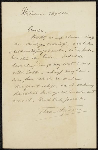
drawing, paper, ink
#
drawing
#
paper
#
ink
#
calligraphy
Copyright: Rijks Museum: Open Domain
Editor: We're looking at Maurits van der Valk's "Brief aan Philip Zilcken," likely from 1905. It’s a drawing on paper, rendered in ink, and resides here at the Rijksmuseum. The elegant script is captivating! I'm immediately drawn to the way the text almost floats on the aged paper. What visual aspects do you find most compelling in this piece? Curator: Immediately, the tension between line and surface asserts itself. Note the contrasting densities within the inking, the careful modulation creating both legibility and a certain...shall we say... atmospheric quality? See, also, the spatial relationships implied by the placement of the script itself, and consider the role of the aged paper as more than mere ground, but as an active compositional element. What does its irregular discoloration signify, structurally? Editor: I see that the uneven discolouration is part of the artwork and affects how the eye moves around the composition. So the visual texture and the calligraphy work together as artistic expression rather than pure communication? Curator: Precisely! It transforms the simple act of correspondence into something akin to abstract mark-making, wouldn’t you agree? We can also consider the very intentional nature of calligraphy itself - how each stroke embodies its own dynamism within a tightly controlled system. It is an ordered, deliberate set of graphic variations on the surface. Editor: That makes me think about the artist’s intent, consciously manipulating both form and texture. This new perspective changes the way I will perceive drawings, and written communication, as a new visual landscape! Curator: Indeed. Observing shifts in artistic paradigms can indeed reveal unexpected, novel experiences.
Comments
No comments
Be the first to comment and join the conversation on the ultimate creative platform.
More like this