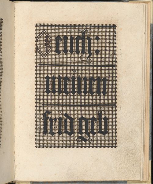
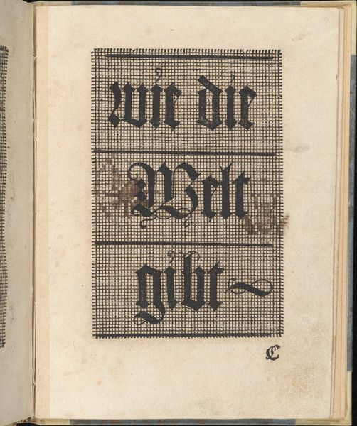
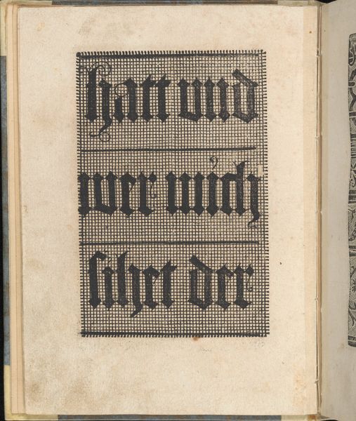
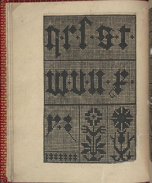
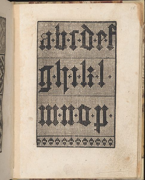
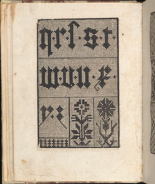
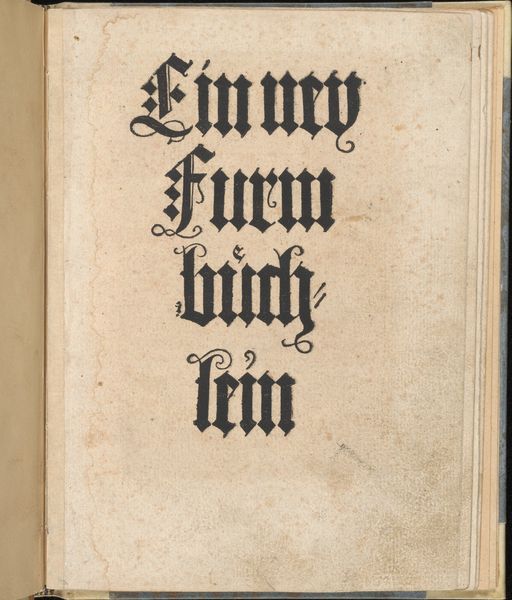
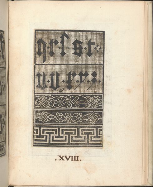
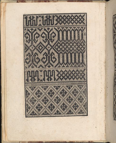
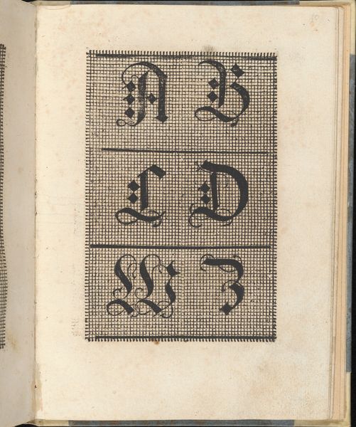
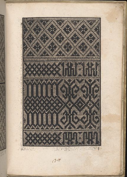
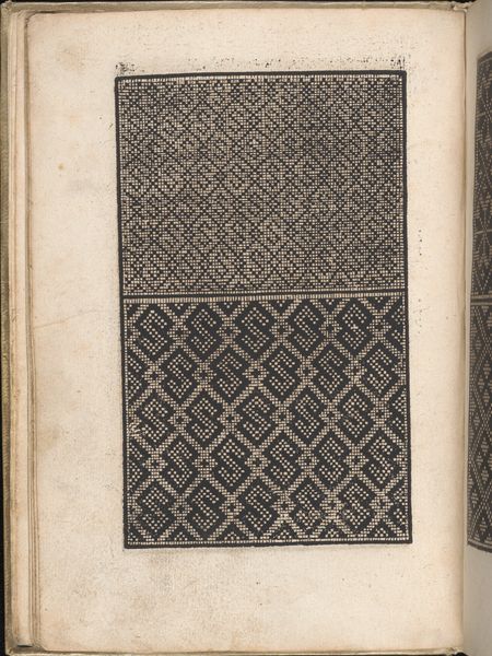
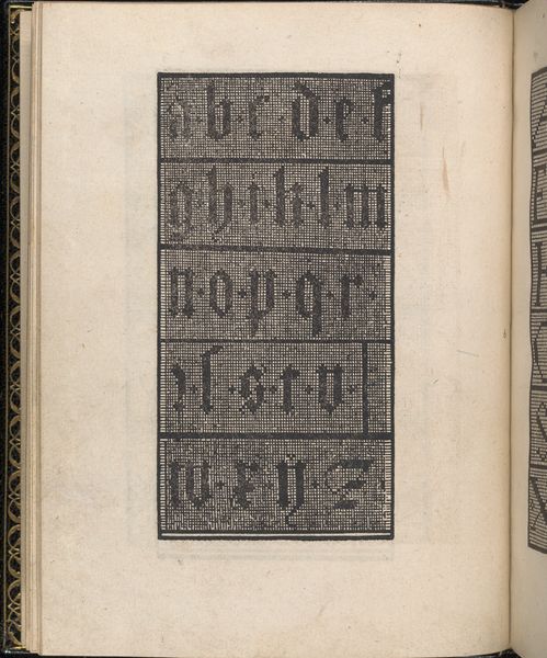
Ein ney Furmbüchlein, Page 4, verso 1520 - 1530
0:00
0:00
drawing, print, paper, typography, woodcut
#
drawing
# print
#
paper
#
typography
#
woodcut
#
northern-renaissance
Dimensions: 7 7/8 x 6 1/8 in. (20 x 15.5 cm)
Copyright: Public Domain
Curator: What an enigmatic little page. Editor: My first thought? Intense. All that gothic script jammed into that grid…it's visually stressful in a way I find weirdly compelling. Curator: Indeed. This is page 4, verso, from *Ein ney Furmbüchlein*, or a New Model Book. It was crafted between 1520 and 1530 by Johann Schönsperger the Younger. A printed drawing—woodcut on paper— held here at the Metropolitan Museum of Art. Model books were patterns available for artisans. Editor: So, a sixteenth-century mood board, kind of? I wonder if someone was using this as inspiration for embroidery, or a fancy cake even. Those letters are so stylized. Imagine trying to replicate that with icing! Curator: Absolutely. These model books served as references, dictating taste. Look how typography takes centre stage, practically enshrined within the graphic space. Editor: That's where the "intense" feeling comes from for me, I think. It feels less like readable text, more like abstract architecture. There's an almost overwhelming weight and rigidity to the lettering style. But it's tempered somewhat, with that lovely almost playful ampersand squiggle connecting things…like a wink in all that austerity. Curator: Exactly, this deliberate interplay captures the tension that underlies visual culture during the Northern Renaissance as letterpress printing gained primacy. It underscores both accessibility and exclusivity depending on where this model-book image gets deployed. Editor: It's fascinating to consider how an image like this navigates those spaces even now. It makes me wonder about our own models, the ones we rely on daily. Are they shaping or limiting our imaginations? Curator: An essential point, well considered! Perhaps *Ein ney Furmbüchlein* offers not just forms, but reminds us to remain cognizant of cultural gatekeeping and, perhaps, subvert established styles? Editor: You've reframed my own experience completely! So next time I feel hemmed in by templates, I might just look to some 16th-century decorative gothic letters. Now that’s inspirational.
Comments
No comments
Be the first to comment and join the conversation on the ultimate creative platform.
More like this