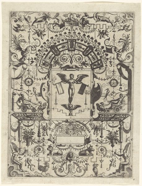
Omslag van het Medisch Weekblad voor Noord- en Zuid-Nederland 1895
0:00
0:00
careladolphlioncachet
Rijksmuseum
graphic-art, print, typography, woodcut, poster
#
graphic-art
#
art-nouveau
#
pen drawing
# print
#
old engraving style
#
typography
#
pen-ink sketch
#
woodcut
#
sketchbook drawing
#
decorative-art
#
poster
Dimensions: height 308 mm, width 223 mm
Copyright: Rijks Museum: Open Domain
Curator: This is the cover for the “Medisch Weekblad voor Noord- en Zuid-Nederland”, a medical journal for the Northern and Southern Netherlands. Carel Adolph Lion Cachet created this work in 1895, employing the woodcut technique which was common in printed ephemera of the time. Editor: It feels so intricate! The detailed fern-like patterns framing the central text give it a very natural and organic feel, doesn't it? The subdued color palette enhances the feeling that this comes from a bygone era. Curator: Absolutely. The organic motifs and flowing lines are characteristic of the Art Nouveau style that gained popularity in response to industrialization. But it's important to remember that period also witnessed advancements in medical science. This design cleverly juxtaposes nature with scientific progress, which highlights their common aim for progress. Editor: The very purpose of this magazine’s cover illustrates that! Cachet used this very popular and, to an extent, progressive aesthetic in art for what at the time would have been groundbreaking developments in medicine. A rather interesting paradox, no? Considering how art has responded to developments within the science of medicine across history. Curator: Indeed. It underscores how design served as a bridge, normalizing scientific knowledge and medical practice for a wider public. The visual language employed had an inherent political charge for the period as well. Think of broader debates about sanitation, public health, and access to healthcare that impacted society during this era. Editor: It definitely reminds us how artwork such as the cover for this periodical participates in, and helps to visualize, scientific advancement in specific material cultures. That dialogue between text and image normalizes medicine, in a sense, and facilitates its dissemination, too. What would modern-day medical journal covers look like by comparison, I wonder? Curator: The integration of medical publications into the sphere of public life also prompts reflection upon our access to, and our interpretation of medical knowledge. What was formerly held by elite specialists is visually broadcast across society with the help of the printing press. Editor: Cachet's woodcut exemplifies how art functions within culture to visualize not only aspirations and ideas but also to participate directly in society and progress. Thank you for pointing out the depth within what I thought was merely an attractive cover design! Curator: The pleasure was all mine. Reflecting on the historical backdrop against which this design was realized, allows us to interpret familiar artwork with fresh eyes and newfound appreciation.
Comments
No comments
Be the first to comment and join the conversation on the ultimate creative platform.
More like this