drawing, print, woodcut
#
drawing
#
medieval
# print
#
woodcut effect
#
form
#
organic pattern
#
geometric
#
woodcut
#
intricate pattern
#
line
#
northern-renaissance
Dimensions: Sheet: 1 7/8 × 1 11/16 in. (4.8 × 4.3 cm)
Copyright: Public Domain
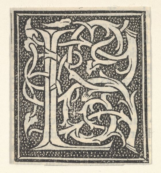
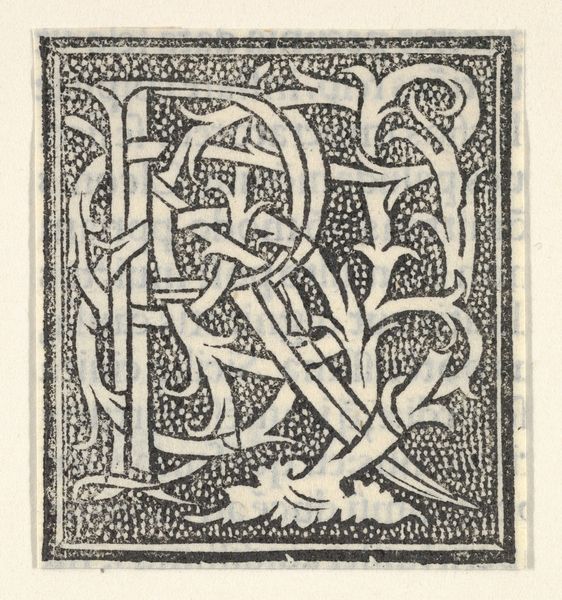
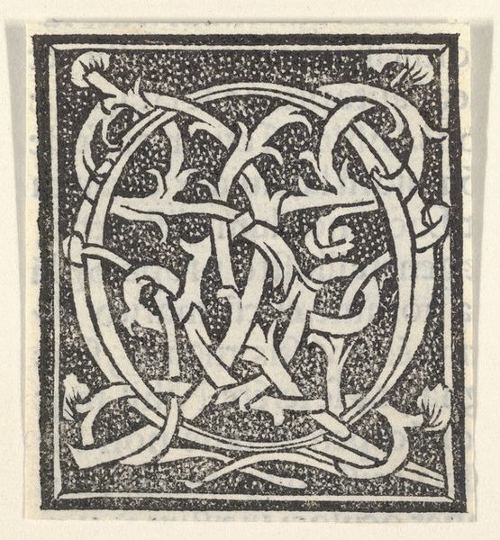
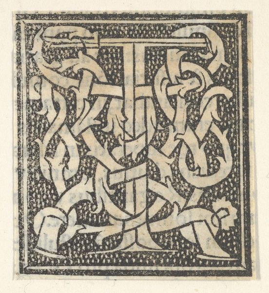
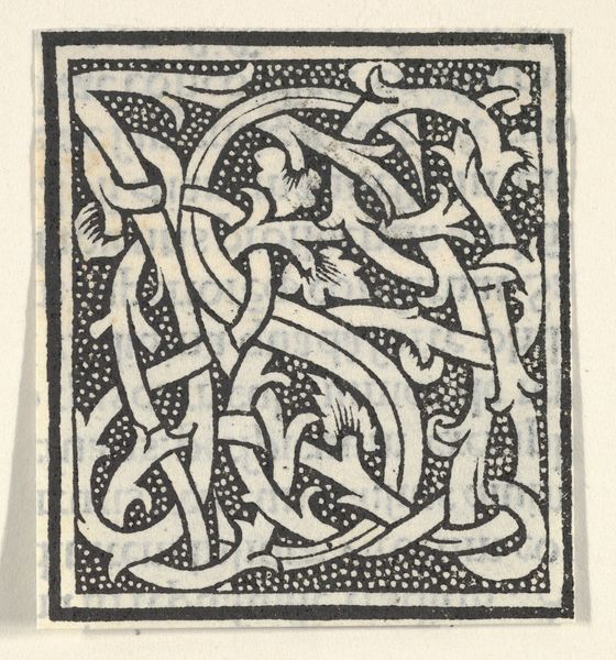
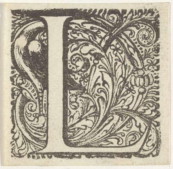
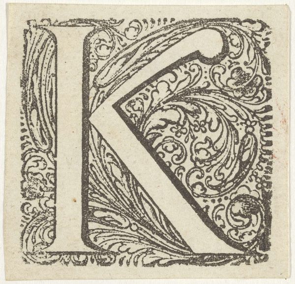
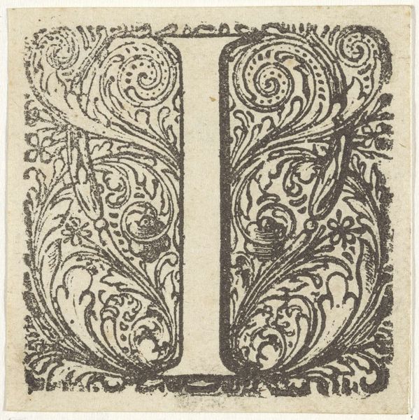
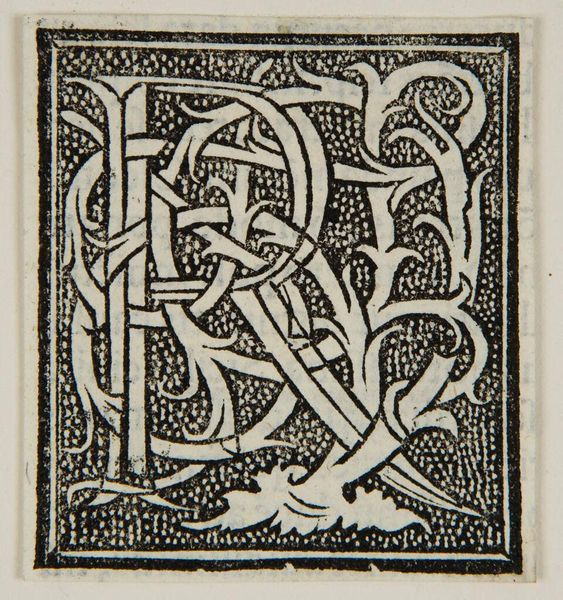
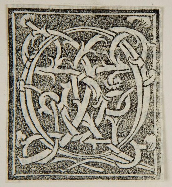
Curator: This intricate design is an initial letter 'M' on a patterned background, a woodcut created around 1520. Currently, it resides in the collection of the Metropolitan Museum of Art. Editor: It's mesmerizing! The stark contrast and detailed texture create an immediate sense of age, of something carefully crafted and dense with meaning. There’s a sense of profound authority conveyed through the crisp lines. Curator: Absolutely. Consider the social context—this piece emerged during a period where the printed word was still gaining cultural and political power. Woodcuts like this were instrumental in disseminating knowledge and shaping public opinion, particularly during the Reformation. The initial "M," depending on its use, could represent powerful institutions or individuals. Editor: Right. The deliberate complexity signals exclusivity. Was it used to legitimize power, perhaps by heading official documents? How accessible was it to different classes, and how did this shape their engagement with nascent literacy? Who exactly would be granted the privilege to gaze upon these patterns, I wonder. Curator: Woodcuts allowed for relatively quick reproduction. Its presence suggests wider reach, at least within literate circles. We see similar initials used across Europe, standardizing texts for a growing reading audience. What truly makes this image pop, however, is how the background amplifies it. Editor: I agree. It isn't mere decoration, but more an ecosystem; an intertwined latticework, even, to represent that the letter itself is only a tiny part of much larger ideas and social networks. What do you think this level of detail brings in terms of access? Do we focus so much on small flourishes in detriment to a larger, global picture? Curator: It’s a trade-off. Such intricate work surely involved highly skilled artisans, reflecting the investment made in textual communication at the time, not the ease to access its final output. So, a powerful symbol intricately carved to inspire even more power among readers. Editor: Right. A compelling paradox of access and exclusion embodied in a single initial. Food for thought. Curator: Indeed. A powerful reminder of how even the smallest artistic choices can reflect and reinforce societal structures.
Comments
No comments
Be the first to comment and join the conversation on the ultimate creative platform.
More like this