Dimensions: height 396 mm, width 296 mm
Copyright: Rijks Museum: Open Domain
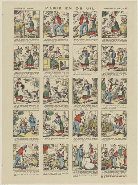
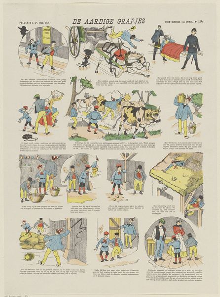
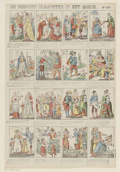
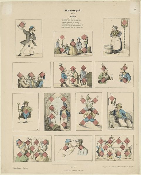
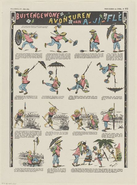
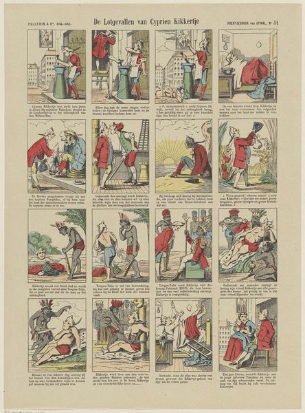
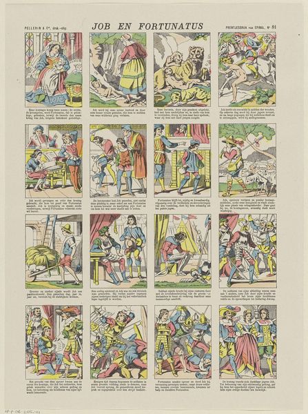
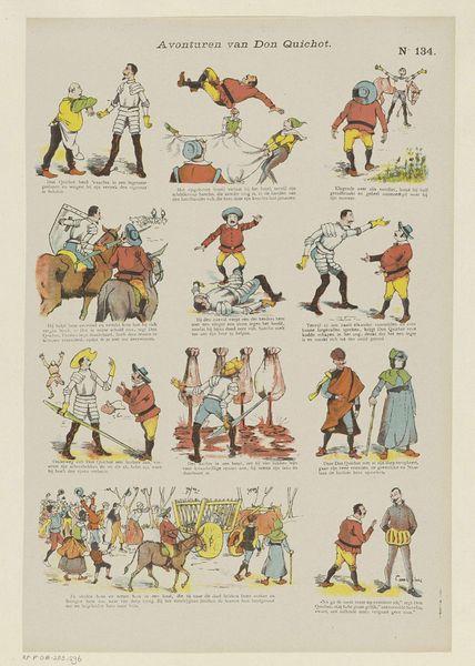
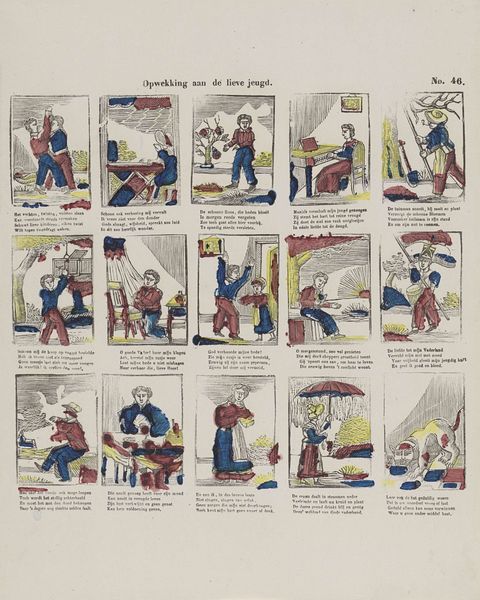
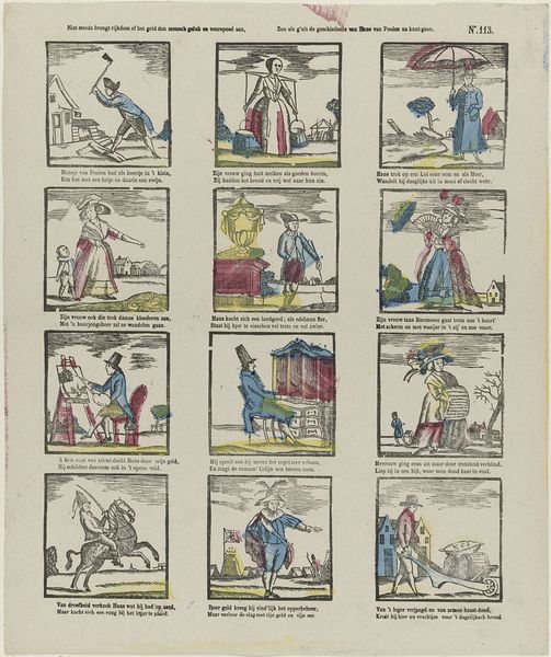
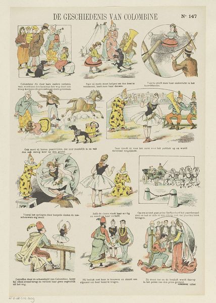
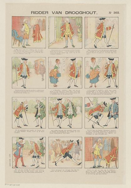
Editor: This is an intriguing print called "Afwisseling in 't ongeluk / Gij zult niet begeeren (...)," created around 1902 by B. Moloch. It looks like a series of sequential cartoon panels, almost like a comic strip. I'm struck by the bold lines and caricatured figures. How do you interpret this work through a formalist lens? Curator: Precisely. Note the rigorous composition of each panel, adhering to a grid structure. This immediately establishes a framework for analysis. Disregarding narrative content, observe how line quality dictates form. See how thick, decisive lines delineate the figures, separating them sharply from the background. The figures themselves are reduced to geometric forms, circles and rectangles predominating. Editor: So, you're focusing on how the artist simplifies and structures the visual elements? Curator: Exactly. And colour too. Notice the limited palette – mostly reds, blues and beige– serving less a representational purpose and more a structural one. Each hue operates as a distinct visual block, contributing to the overall pattern and rhythm across the page. The artist strategically deploys these colours to create emphasis. Consider the chromatic relationship between adjacent panels and within each frame to further elaborate the composition and visual balance of this artwork. How do these relationships modify the artwork's appearance? Editor: It is really fascinating how analysing the basic art elements of line, colour, and structure can unlock a whole new level of interpretation, aside from any story they might be telling. Curator: Precisely! By prioritizing formal elements, we arrive at a fundamental understanding of the artistic intentions and compositional elements of the print.
Comments
No comments
Be the first to comment and join the conversation on the ultimate creative platform.
More like this