drawing, watercolor
#
drawing
#
water colours
#
allegory
#
watercolor
#
coloured pencil
#
history-painting
#
academic-art
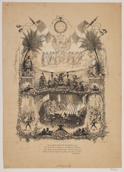
Dimensions: height 370 mm, width 486 mm
Copyright: Rijks Museum: Open Domain
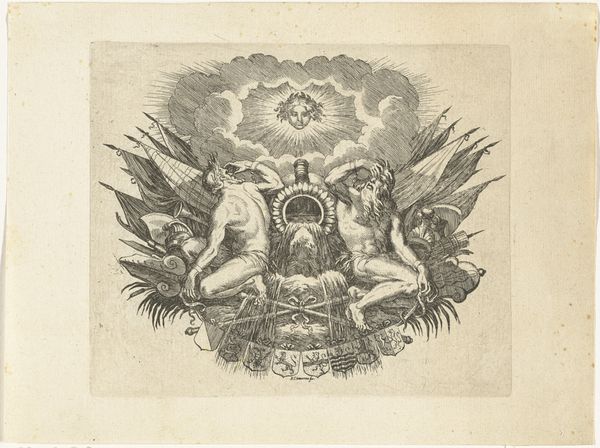
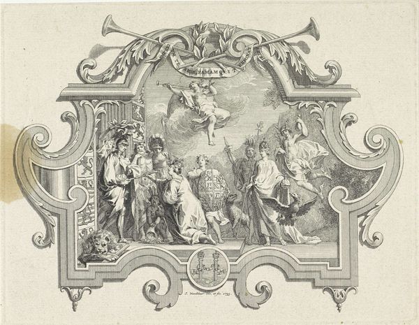
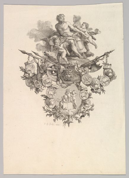
Curator: Here we have Johan Philip Koelman's "Ontwerp voor een Diplome d'Honneur" from 1869, rendered in watercolour and coloured pencil. Editor: My immediate reaction is one of bombastic symbolism, bordering on saccharine. The pastel shades and the putti galore feel, dare I say, a tad overdone. Curator: Perhaps. But look closer; these seemingly stock allegorical figures embody powerful currents of history and national identity. Consider how the figure of the goddess, with her laurel wreath, functions as a classic symbol of recognition and achievement. She represents the 'honneur' itself. Editor: I see it, but that rigidly symmetrical composition reinforces my impression of excessive formality. The hard edge of the diploma banner set against the wispy clouds feels contradictory, almost like the work strains for effortless transcendence but remains earthbound. Curator: I disagree; the flags arranged below, aren’t they representative of many countries? Doesn't the artist offer us the suggestion that achievements that deserve the highest honor go beyond borders? In its original cultural context, this design wasn’t meant to just depict success. It was designed to enshrine it within a web of culturally loaded signifiers. Editor: I grant you that there's a deliberate, conscious effort to embed cultural meaning here. Those heraldic shields certainly speak volumes. It's precisely the *obviousness* of the symbolism that makes it so aesthetically overwrought. The formal, symmetrical construction only underlines that. Curator: But perhaps that's the point? Honour isn't meant to be subtle; it's intended to be proclaimed, to resonate through time and cultures, much like how symbolic meaning perseveres throughout historical and societal evolutions. This, the artist communicates successfully using historical elements, colours, figures, and flags. Editor: An interesting view indeed. Though I continue to find the color palette a touch too sweet, your iconographic decoding has enriched my perspective, revealing layers of intention that were not immediately apparent. Curator: And your structural examination provides a useful reminder about the aesthetic conventions shaping its original appeal. Thanks to our discussion, I better see how the visual impact operates in tandem with symbolic depth.
Comments
No comments
Be the first to comment and join the conversation on the ultimate creative platform.
More like this