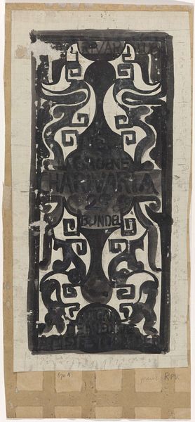
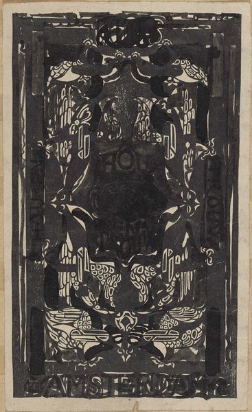
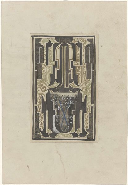
Ontwerp voor drukwerk voor Boekbinderij der Vakschool voor Typografie, uitgave augustus 1916 1874 - 1945
0:00
0:00
graphic-art, mixed-media, print, linocut, typography, poster
#
graphic-art
#
mixed-media
#
art-nouveau
# print
#
linocut
#
book
#
old engraving style
#
woodcut effect
#
typography
#
linocut print
#
poster
Dimensions: height 165 mm, width 203 mm
Copyright: Rijks Museum: Open Domain
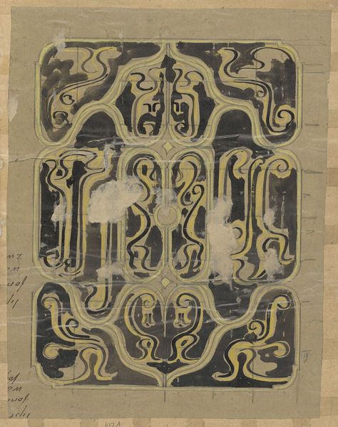
Carel Adolph Lion Cachet made this design for print work for the book bindery of the School of Typography in August 1916. It’s made using ink on paper, and you can see how the bold, graphic style uses contrasting black and white to create a dynamic image. Look at the details! The ink is applied with varying pressure, giving the lines a handmade, almost wobbly quality. There’s a really interesting tension between the rigid geometric forms and the fluid, organic swirls. I like how the composition balances symmetry with asymmetry, creating a sense of visual rhythm that really pops! The way the text integrates with the design elements is pretty cool too, blurring the line between typography and ornamentation. Thinking about other artists, I’m reminded of the bold graphic style of someone like Aubrey Beardsley, but with a more utilitarian, modernist sensibility. This piece really captures the energy and experimentation of early 20th-century design. It embraces both control and accident, certainty and ambiguity.
Comments
No comments
Be the first to comment and join the conversation on the ultimate creative platform.
More like this