drawing, paper, typography, ink
#
drawing
#
art-nouveau
#
blue ink drawing
#
paper
#
typography
#
ink
#
geometric
#
decorative-art
Dimensions: height 240 mm, width 150 mm
Copyright: Rijks Museum: Open Domain
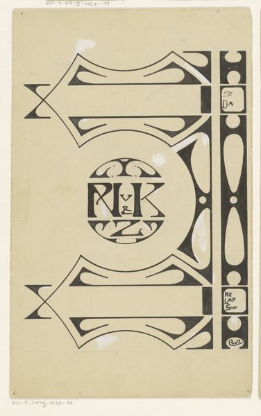
Editor: Here we have Carel Adolph Lion Cachet's "Ontwerp voor Jan Ligthart kalender voor 1918," a drawing made with ink, paper, and typography in the Art Nouveau style. The geometric design and subdued colors give it a somewhat serious, almost somber feel. How do you interpret this work in its historical context? Curator: Well, it’s fascinating to consider this calendar design within the context of World War I, which was still raging in 1918. Even though the Netherlands remained neutral, the war had a profound impact on Dutch society. This design, with its rigid geometric shapes and subdued palette, might reflect the anxieties and the sense of austerity that permeated daily life. Do you notice how the Art Nouveau elements are quite restrained here? Editor: Yes, it's a more angular and less florid Art Nouveau than I’m used to seeing. It almost feels…industrial. Curator: Precisely. This could be a response to the growing industrialization of the early 20th century. Artists were grappling with how to reconcile traditional craftsmanship with the machine age. Perhaps the clean lines and simplified forms were Cachet’s way of embracing a modern aesthetic while still maintaining a connection to decorative art traditions. How might a mass-produced calendar, designed with this aesthetic, influence public perception of time and the war itself? Editor: It's interesting to think of this as more than just a calendar. Its design could shape how people felt about the passage of time and events happening around them. Like, if the war was tough for people at home, would the public embrace something like this in their homes, or would they be more eager to get more traditional art? Curator: That's a critical question. The design's reception would depend on its resonance with the public mood and whether it fulfilled a perceived need for either solace or a reflection of reality. It underscores art's function beyond mere aesthetics. It makes me curious about what Cachet’s intentions were by choosing a muted color palette rather than opting for brighter colors, even though this piece is classified as art-nouveau. Editor: I see that now. I had just thought the geometric pattern looked cool, but all the potential social meaning is really intriguing to explore.
Comments
No comments
Be the first to comment and join the conversation on the ultimate creative platform.
More like this