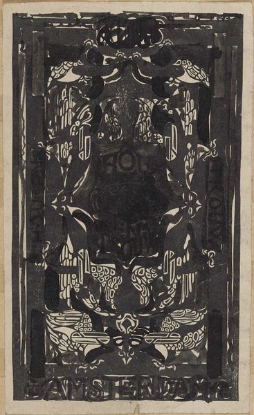
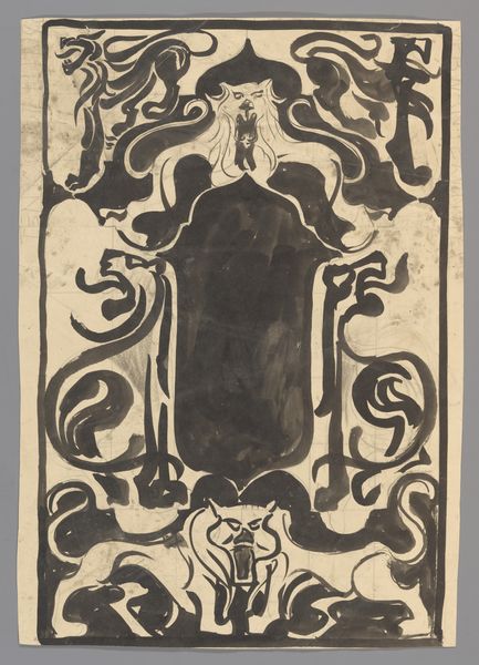
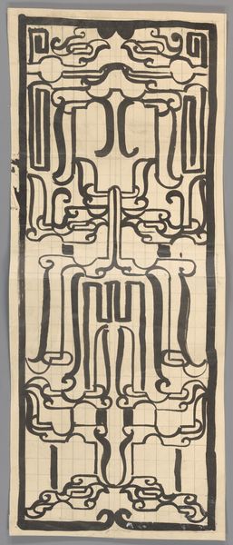
Ontwerp voor titelblad van Charivaria, 2e bundel 1874 - 1945
0:00
0:00
careladolphlioncachet
Rijksmuseum
drawing, graphic-art, paper, ink, pencil, poster
#
drawing
#
graphic-art
#
toned paper
#
art-nouveau
#
ink paper printed
#
paper
#
ink
#
pencil
#
poster
Dimensions: height 270 mm, width 132 mm
Copyright: Rijks Museum: Open Domain
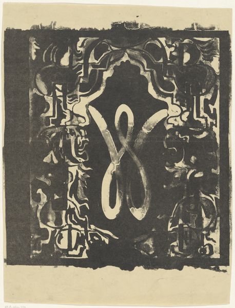
Carel Adolph Lion Cachet made this title page design for the second volume of Charivaria with brush and ink. It looks like the kind of spontaneous inky design you get when you just let your hand do its thing. There's something so raw about the way Cachet uses ink. The blacks are so dense, almost like he’s carving out the design with a heavy hand, and you can feel the texture of the paper underneath, giving it a real, tactile presence. Look at the way the ink bleeds slightly at the edges of the letters, creating a halo effect that softens the rigid geometric forms. In the center, you can see how he’s layered the ink to create depth, with some areas almost disappearing into shadow. This reminds me of the graphic work of someone like Emil Ruder, who was interested in structure. I see art as an ongoing conversation, where artists riff off each other’s ideas across generations, and this piece is a perfect example of how something seemingly simple can be so complex and open to interpretation.
Comments
No comments
Be the first to comment and join the conversation on the ultimate creative platform.
More like this