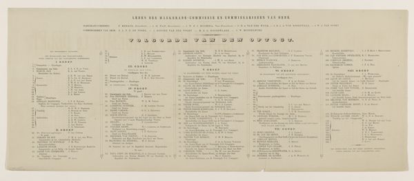
print, typography, poster
# print
#
typography
#
poster
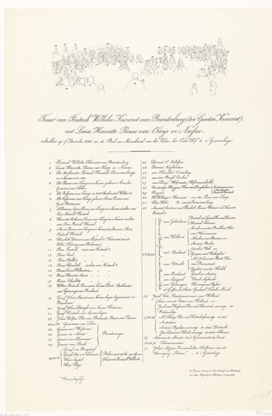
Dimensions: height 270 mm, width 670 mm
Copyright: Rijks Museum: Open Domain
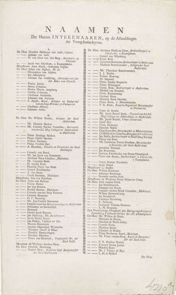
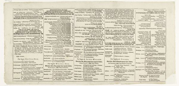
Editor: Here we have “Namenlijst van de groepen in de Delftse optocht, 1862,” by H. Nijgh, a printed poster currently held at the Rijksmuseum. It seems purely informational, a long list organized in columns. How might we analyze this through a formalist lens? Curator: Indeed, let's consider the elements. Notice the deployment of typography; its regimented layout establishes a clear hierarchy. Each name, meticulously typeset, contributes to the overall grid-like structure. Consider the negative space, how it delineates and frames each section. Editor: The arrangement is almost architectural in its rigidity. But what is the effect? Curator: Precisely. The impact is one of order and control. Observe how the variations in font size denote differing levels of importance. The uniformity speaks to the collective endeavor, emphasizing the structure over the individual. Can we say this suggests a celebration through formal means? Editor: I see how the deliberate use of space and the uniform font contribute to a sense of collective identity rather than individual expression. The organization becomes the message. Curator: The formal attributes serve not just as carriers of information, but also creators of meaning. We must look to the relationship between these aesthetic components. Consider how the repetition of names within this structure offers a compelling interplay of figure and ground, information and abstraction. What new avenues of exploration might this stimulate in your estimation? Editor: It's remarkable to consider how the structure transforms a mere list into an artifact rich in potential interpretations. Curator: Precisely. A keen observation on how artistic intent and visual representation might intertwine with one another, as well as impact any viewer in general.
Comments
No comments
Be the first to comment and join the conversation on the ultimate creative platform.
More like this