Dimensions: height 242 mm, width 250 mm, thickness 14 mm
Copyright: Rijks Museum: Open Domain
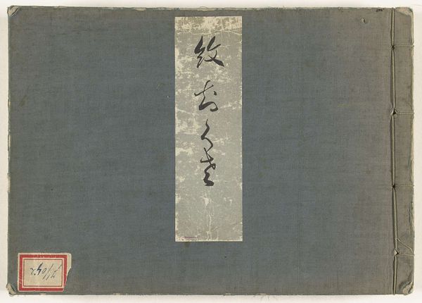
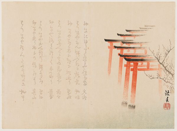
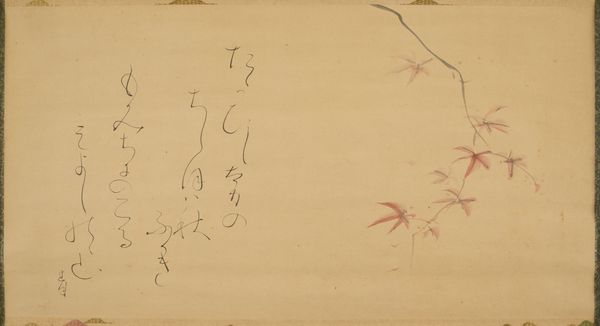
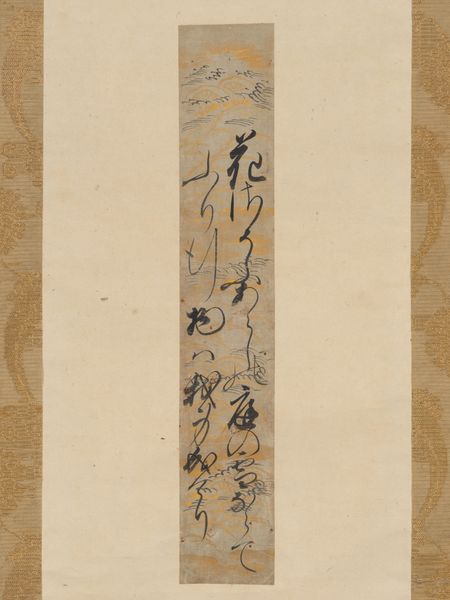
Editor: We're looking at "Blue Maple Leaves" by Tsuda Seifu, made around 1901. It's an ink print on paper, currently held at the Rijksmuseum. The composition feels almost like a study in contrasts—the rigid lines of the cartouche against the flowing forms of the text. How do you interpret this work? Curator: Focusing purely on its formal elements, the interplay between positive and negative space is quite striking. The neutral ground serves to highlight the boldness of the inscribed area. Note how the textured field behind the script gives way to a paler grey where the maple leaves likely featured. Editor: So the artist used different surfaces for textual or visual representation? Curator: Indeed. The layering is subtle, a semiotic relationship of texture and message, a tension across surfaces. The visual vocabulary itself is simple, even reductive, yet rich in tonal gradations within the forms. How do you perceive the materiality of the print itself? Editor: I see the paper has an interesting texture; that might impact the color? Curator: Precisely. The choice of paper stock contributes fundamentally to our experience of the colors. The absorption rate of the ink, and the reflective qualities of the paper fibres…these aspects become integral to the aesthetic meaning. This close attention to materiality encourages us to think about printmaking as an intimate, tactile experience. Editor: I'm realizing how much the texture influences how I read the artwork. I had missed all that nuance! Curator: The beauty is in the construction! It challenges the eye, the surface and the inscription acting together.
Comments
No comments
Be the first to comment and join the conversation on the ultimate creative platform.
More like this