drawing, lithograph, print, paper
#
drawing
#
art-nouveau
#
water colours
#
lithograph
# print
#
landscape
#
etching
#
paper
#
watercolour illustration
Dimensions: height 521 mm, width 702 mm
Copyright: Rijks Museum: Open Domain
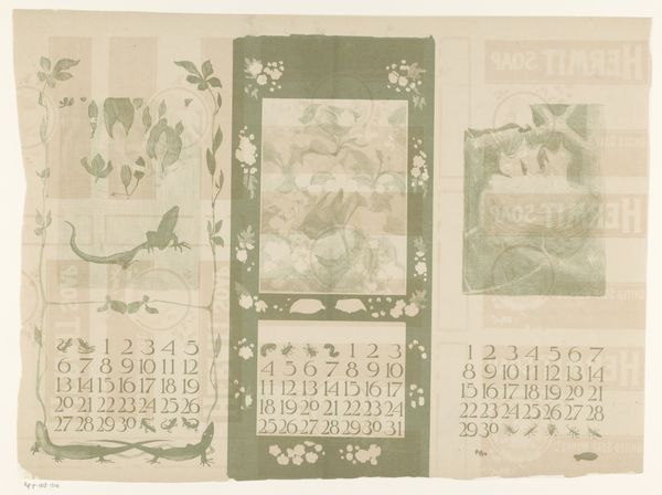
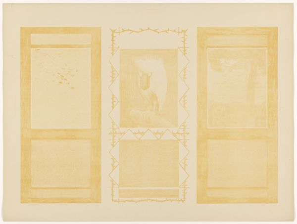
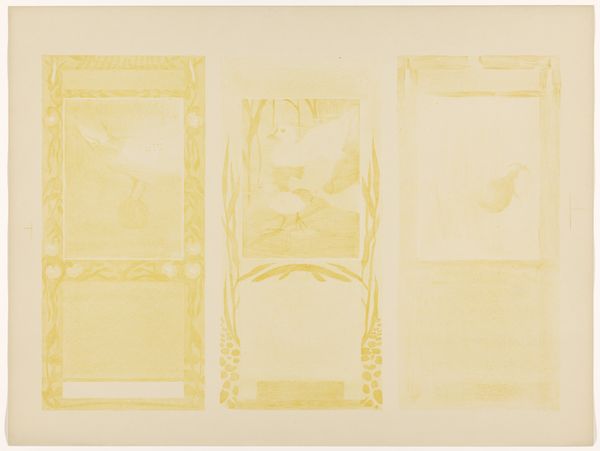
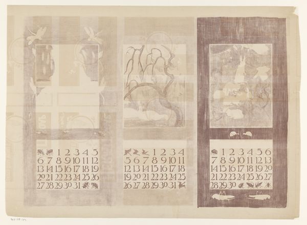
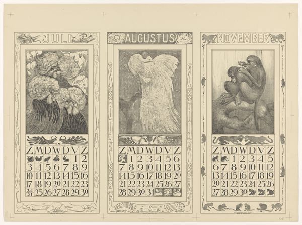
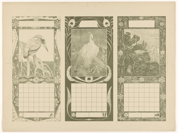
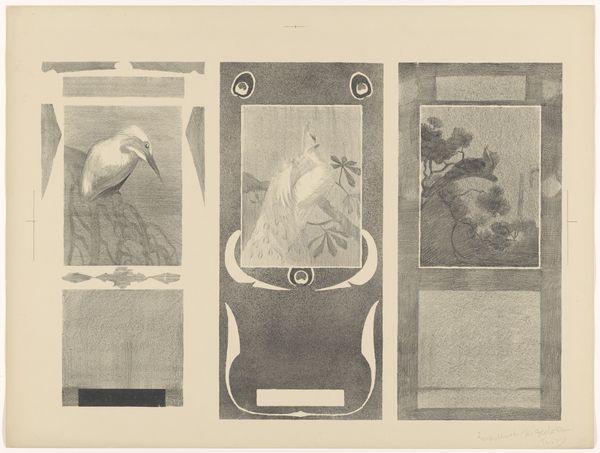
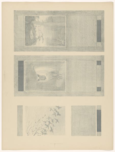
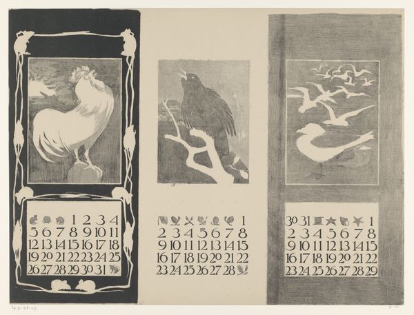
Theo van Hoytema made this calendar for July, August, and November 1910. It’s a lithograph, and it uses this pale, almost sepia tone, which gives it such a tender, faded feeling. It makes me think about how we mark time, how fragile our grip on it is. Look at the August panel, the way the swans are rendered, almost dissolving into the background. The softness of the crayon, or whatever he used, makes the image look almost like a memory, something that’s just barely there. There’s a real sense of process here, not trying to hide the hand, but embracing the imperfection of it. It feels very modern for its time. It reminds me a little bit of Odilon Redon. Both artists aren’t afraid of ambiguity, of letting the image be a little unclear, a little mysterious. It’s like they’re more interested in the feeling of a thing than the thing itself. I think that’s something a lot of us artists can relate to.
Comments
No comments
Be the first to comment and join the conversation on the ultimate creative platform.
More like this