drawing, graphic-art, print, paper, watercolor
#
drawing
#
graphic-art
#
art-nouveau
# print
#
floral element
#
paper
#
watercolor
#
ceramic
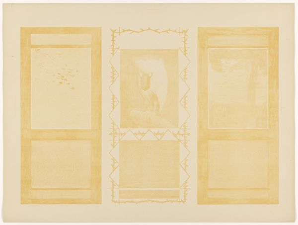
Dimensions: height 733 mm, width 553 mm
Copyright: Rijks Museum: Open Domain
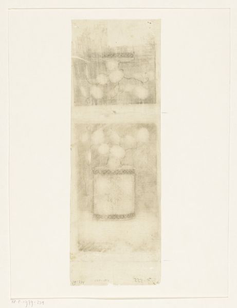
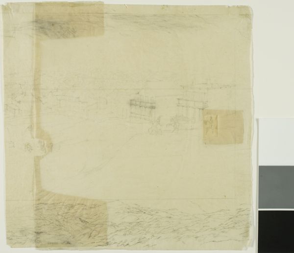
Editor: This is Theo van Hoytema's "Kalenders voor augustus, juni en december 1904," created in 1904. It looks like a drawing or a print, maybe watercolor on paper. I'm struck by its muted colors and the delicate, almost ghostly imagery. What do you see in this piece? Curator: It’s fascinating how Hoytema uses these pale washes to depict these months. Consider the calendar itself. It's not just a functional object; it’s a symbol of time, cycles, and memory. Notice the birds - they each point to different seasonal tasks. Hoytema subtly embedded seasonal information and practical knowledge in what appears to be an aesthetic image. What emotional associations come up when you look at these months displayed together? Editor: Well, there’s a melancholic feeling...a sense of the year passing, but in a gentle way. Like memories fading into each other. Curator: Exactly! Think about the symbolism of light, and consider the cultural context of art nouveau: artists were interested in using floral elements. The print creates an overall mood - evoking nostalgia or a longing for nature in the face of increasing industrialization. Do you find that the calendar’s format challenges the very nature of an artwork? Editor: It’s interesting you say that! Because it feels less like a functional calendar and more like a collection of impressions. Thanks for pointing out those nature elements; they enrich it further. Curator: Indeed, the intersection of functionality and artistic expression truly elevates it. Thank you.
Comments
No comments
Be the first to comment and join the conversation on the ultimate creative platform.
More like this