drawing, paper, ink
#
drawing
#
hand-lettering
#
hand drawn type
#
hand lettering
#
paper
#
personal sketchbook
#
ink
#
hand-drawn typeface
#
ink drawing experimentation
#
pen-ink sketch
#
pen work
#
sketchbook drawing
#
genre-painting
#
sketchbook art
#
modernism
Copyright: Rijks Museum: Open Domain
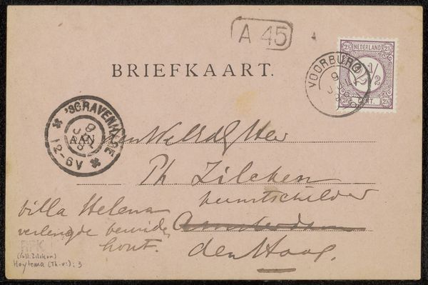
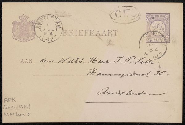
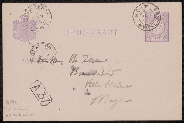
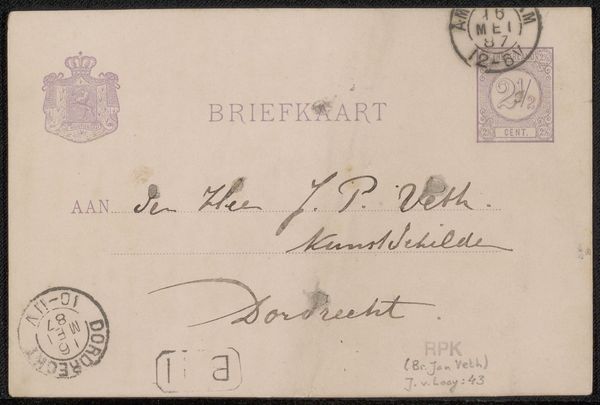
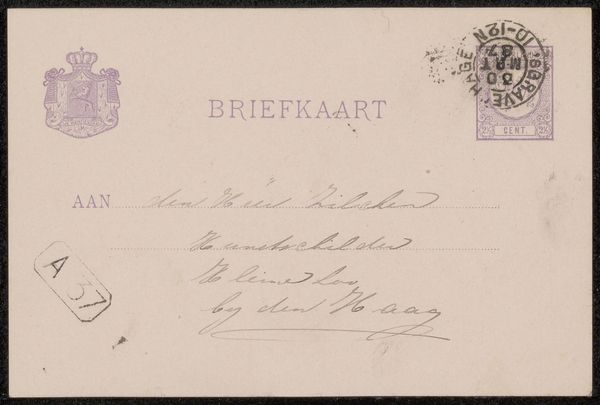
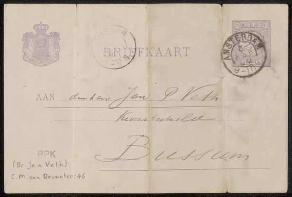
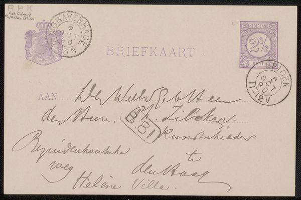
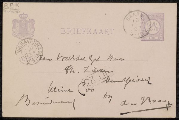
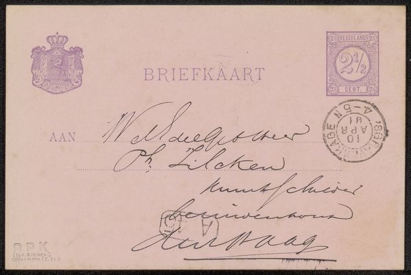
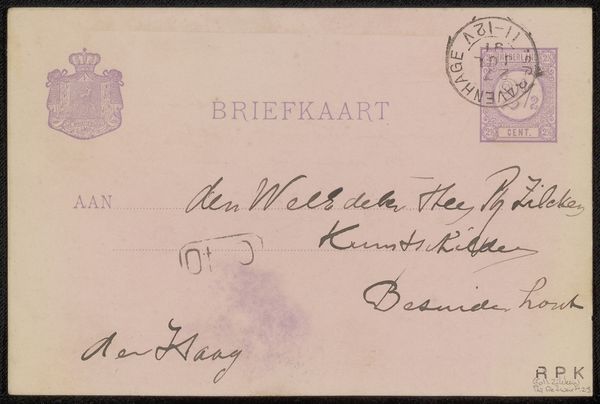
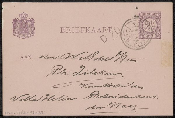
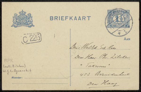
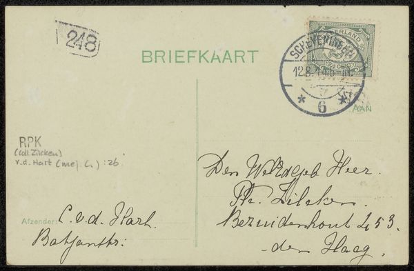
Editor: Here we have Jac van Looij’s "Briefkaart aan Jan Veth," dating back to before 1884, a drawing in ink on paper. It looks like a simple postcard, but the lettering and the details feel very intentional, almost like an artwork in itself. What do you see in this piece that speaks to you? Curator: This postcard is fascinating. Look at how van Looij uses script, transforming what is functional – a postal address – into a statement. Note how the postmarks aren't just cancellations, but become integrated visual elements. Editor: Right, it is not only information, there is a sensibility! Curator: Exactly. Consider the cultural memory embedded in handwritten script during that era, its value compared to the growing presence of print. The deliberate imperfections, the flourishes—what do those evoke for you? Editor: A sense of personality and care. It’s much more intimate than something typed or printed, you know? It also reminds me of how people created their own fonts later in the early nineties when personal computers and laser printers came about! Curator: Precisely. And do you recognize how each visual element – stamps, script, and even the smudges – act as little icons contributing to the card's unique identity and authenticity? A printed card would lose this immediately! Editor: That’s true. Each element has its own story to tell about its time. Thanks. It gives a whole new level of appreciation to what looks like a simple postal item. Curator: And through these objects, we find lasting memories that remain.
Comments
No comments
Be the first to comment and join the conversation on the ultimate creative platform.
More like this