drawing, paper, ink
#
portrait
#
drawing
#
paper
#
personal sketchbook
#
ink
Copyright: Rijks Museum: Open Domain
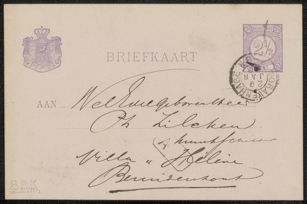
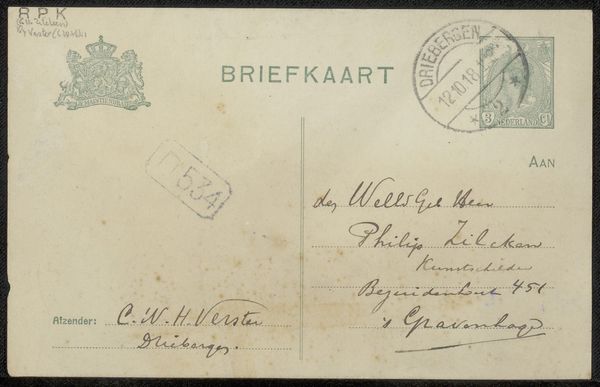
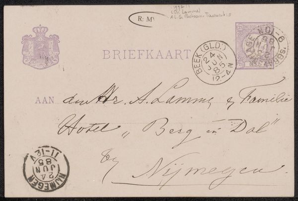
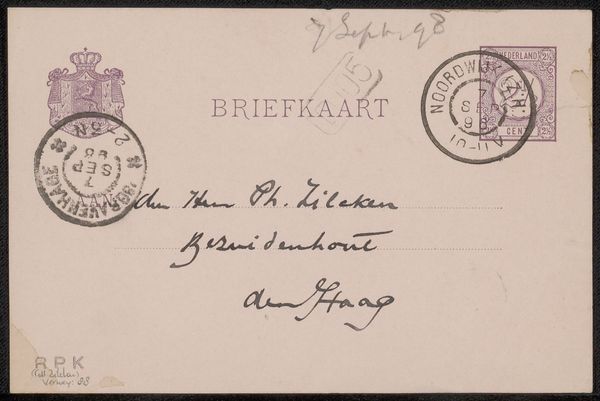
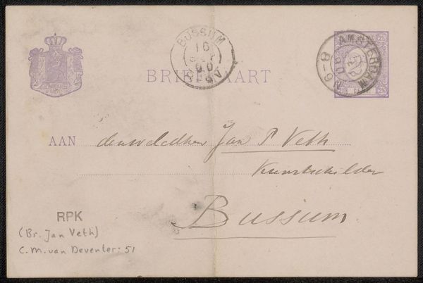
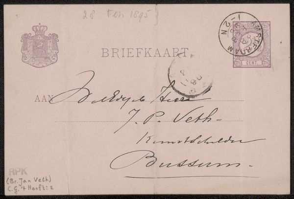
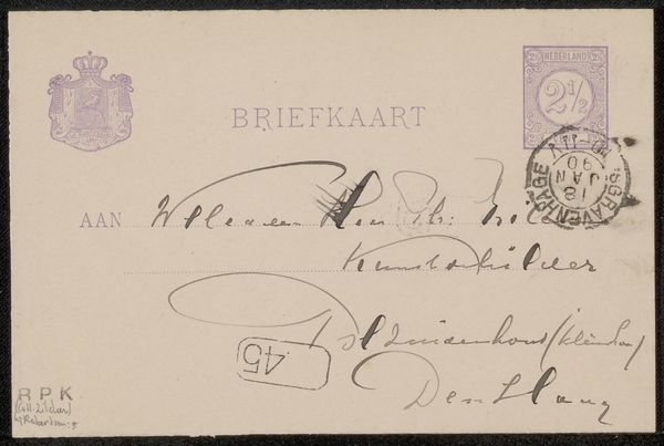
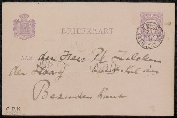
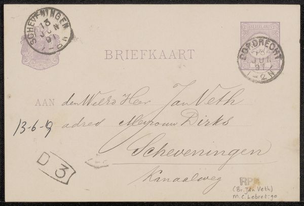
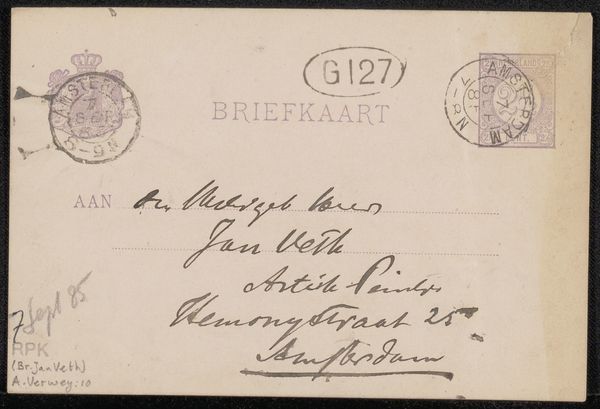
Here we have a 'Briefkaart aan Jan Veth', created by Chap van Deventer. At first glance, the postcard's surface is dominated by shades of off-white, with a series of purple and grey markings distributed across its surface. The eye is drawn to the careful handwriting and the official stamps, each a self-contained unit within the broader composition. The structure of this piece is particularly intriguing. Van Deventer employs a flat, almost diagrammatic approach, treating the postcard less as a vehicle for personal expression and more as a structured field of communication. The calculated placement of textual elements, combined with the official seals, establishes a tension between personal and bureaucratic language. The postal markings—the crown, stamps, and carefully inscribed address—act as signifiers. Each carries a specific weight. Consider how the postcard’s design reflects the broader cultural moment. Its engagement with language and institutional forms mirrors the growing preoccupation with semiotics and structuralism, inviting us to read the postcard as a carefully arranged system of signs rather than simply a casual message. This elevates the mundane into a deliberate act of communication, underscoring how meaning is constructed through form and function.
Comments
No comments
Be the first to comment and join the conversation on the ultimate creative platform.
More like this