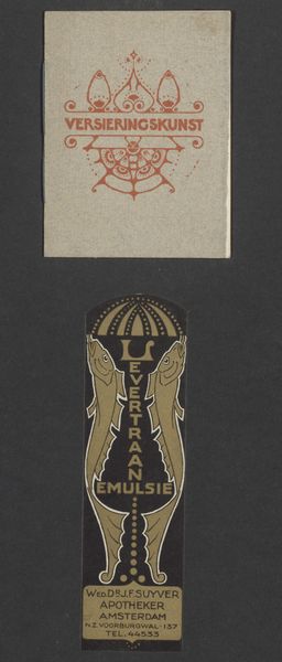
Ontwerpen voor vignetten van Bureau voor Reclame en Versieringskunst Mimosa 1884 - 1952
0:00
0:00
drawing, graphic-art, typography, ink
#
drawing
#
graphic-art
#
art-nouveau
#
typography
#
ink
#
decorative-art
Dimensions: height 54 mm, width 188 mm
Copyright: Rijks Museum: Open Domain
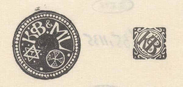
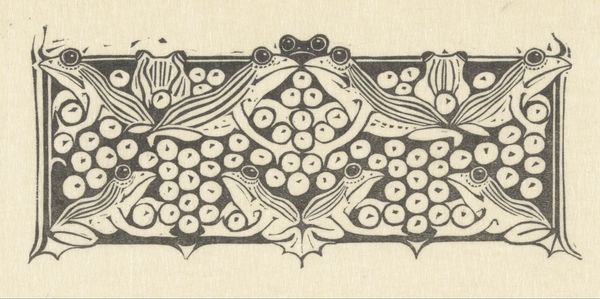
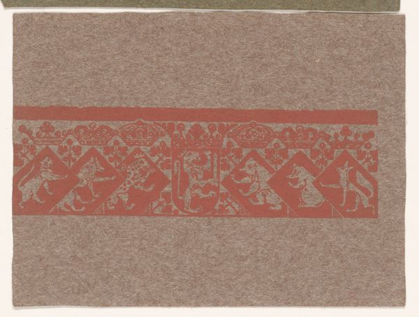
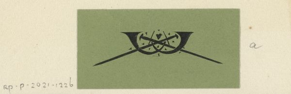
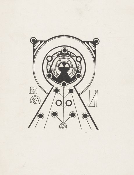
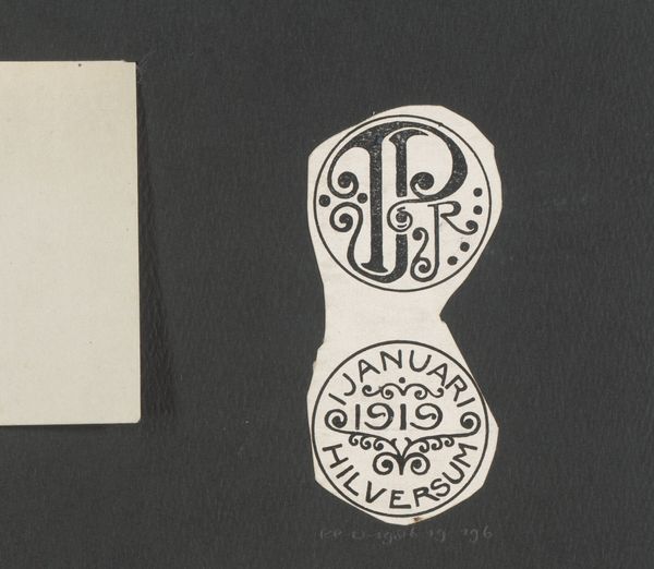
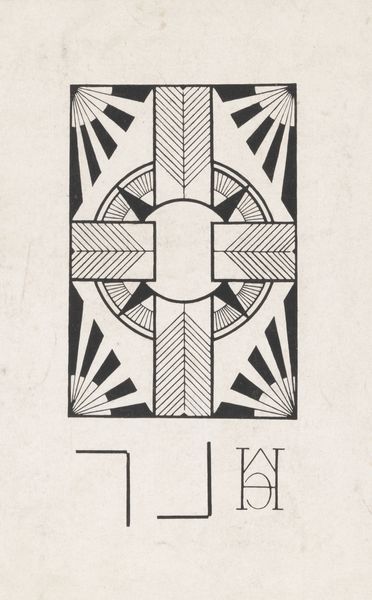
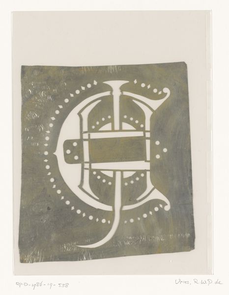
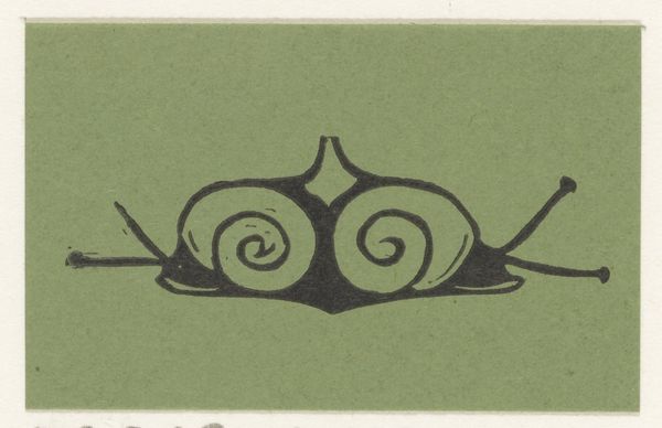
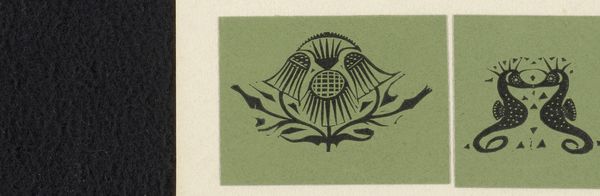
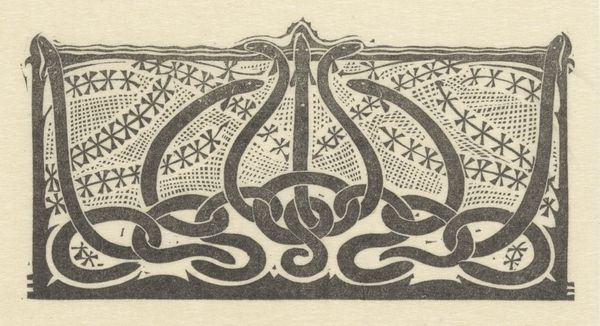
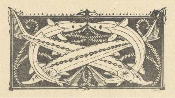
Curator: Here we have "Ontwerpen voor vignetten van Bureau voor Reclame en Versieringskunst Mimosa" which translates to "Designs for vignettes of the Mimosa Bureau for Advertising and Decorative Arts." The artist, Reinier Willem Petrus de Vries, seems to have created this sometime between 1884 and 1952. Editor: My first impression? Elegance, but with a definite quirky energy. It looks like someone's having a bit of fun with the very *idea* of professional polish. The stylized text jumps out – almost daring you to decode it. Curator: Indeed! The vignettes were likely designed for stationery or promotional material. Look at the beautiful art nouveau style, quite popular at the time. The use of simple black ink really allows the designs to pop. Note that graphic art such as this also often had a key political function, communicating ideological messages through the medium. Editor: I love that circular motif in the center vignette. The typography curving around it makes me feel like I am peering through some magical portal into a blooming idea. What message could have been implied via these "blooming ideas"? Curator: Well, this connects to advertising's evolution. Early advertising, particularly with Art Nouveau aesthetics, sought to ennoble products with beauty and charm to reflect society, enticing consumers with aspirational aesthetics alongside functional benefits, shifting public perception of what they bought! Editor: I see it, like planting subtle seeds of desire! And the overall decorative nature… it feels so intentionally crafted to catch the eye, so very alluring to see on any stationary. It gives a touch of sophisticated wit. Curator: Precisely! These designs also reflected cultural tastes. Notice how design incorporates imagery in patterns that convey wealth and well being. This vignette speaks to a culture obsessed with branding, identity, even the self. Editor: It is intriguing how such simplicity evokes so much, especially when you consider each piece would have likely been quite small. Just imagine receiving mail adorned with one of these; It adds a unique signature that demands notice! Curator: Agreed. Art like this compels us to reconsider assumptions on art’s use within society. In doing so, we begin understanding its purpose more thoughtfully. Editor: Absolutely. It serves as a gentle nod, maybe we should pay much closer consideration towards artwork's context within our societies; truly fascinating.
Comments
No comments
Be the first to comment and join the conversation on the ultimate creative platform.
More like this