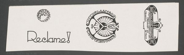
Reclameboekje voor lessen in Versieringskunst door R.W.P. de Vries Jr. en een apothekersetiket voor levertraanemulsie 1884 - 1952
0:00
0:00
graphic-art, print, typography, poster
#
graphic-art
#
type repetition
#
aged paper
#
art-nouveau
#
reduced colour palette
# print
#
fashion mockup
#
paper texture
#
historical fashion
#
typography
#
fabric design
#
embossed
#
decorative-art
#
poster
#
design on paper
#
foil embossing
Dimensions: height 107 mm, width 81 mm, width 160 mm, height 155 mm, width 45 mm
Copyright: Rijks Museum: Open Domain
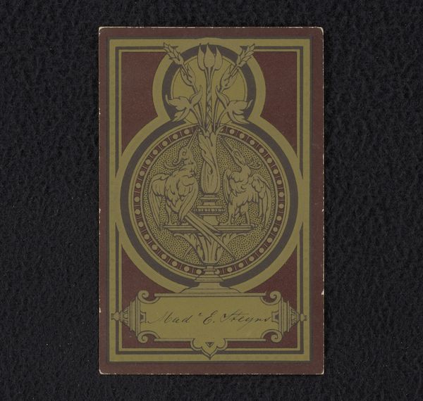
These are advertising designs by Reinier Willem Petrus de Vries Jr. Here, the twin fish on the apothecary label strike me as particularly significant. Fish, from ancient times, has represented abundance, fertility, and transformation. Consider the early Christians adopting the fish as a secret symbol of their faith, the "ichthys," resonating with themes of spiritual nourishment and rebirth. Yet, here, these fish flank the word 'Levertraan' - cod liver oil. The symbol has been subtly transformed, linking the promise of vitality not just to spiritual well-being but to physical health. It suggests that the ancient symbolism of the fish is alive and well, constantly being adapted to new cultural and commercial contexts, reminding us of the enduring power of symbols to bridge the gap between the past and the present.
Comments
No comments
Be the first to comment and join the conversation on the ultimate creative platform.
More like this