graphic-art, print, typography
#
graphic-art
# print
#
typography
#
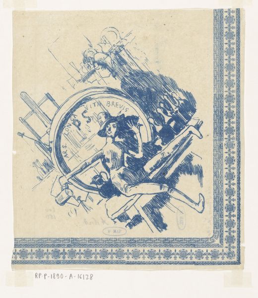
pen-ink sketch
#
symbolism
Dimensions: height 84 mm, width 104 mm
Copyright: Rijks Museum: Open Domain
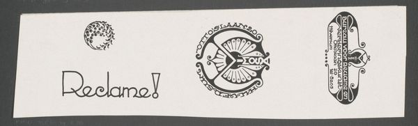
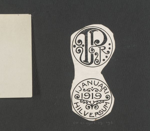
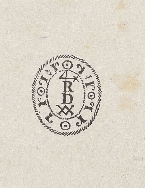
These Monogrammen van K.P.C. de Bazel en M. Lauweriks were made by Mathieu Lauweriks, and though we don’t know the precise date, the image is made up of the kind of geometric abstraction which Lauweriks was known for. Both of these designs have a graphic quality, like a stamp or seal. The repeated dots that form the border of the circular monogram have a real texture to them. You can imagine the pressure of the tool creating each tiny, raised bump. The letters are bold and sans serif, giving them a kind of modern edge despite the old-world feel of the monogram. The choice of symbols – the star and the cross – feels particularly meaningful. There’s something about these symbols from different traditions being brought together in this design that makes the work feel open-minded and full of possibility. I'm reminded of Hilma af Klint's work and her abstract symbolic language, also trying to distill spiritual forms, though in a very different style. Ultimately, this monogram feels like a tiny but powerful statement about unity and connection.
Comments
No comments
Be the first to comment and join the conversation on the ultimate creative platform.
More like this