Copyright: Public domain US
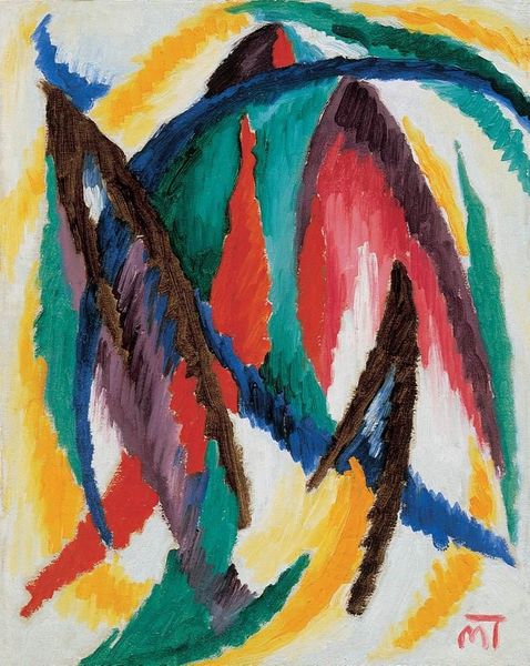
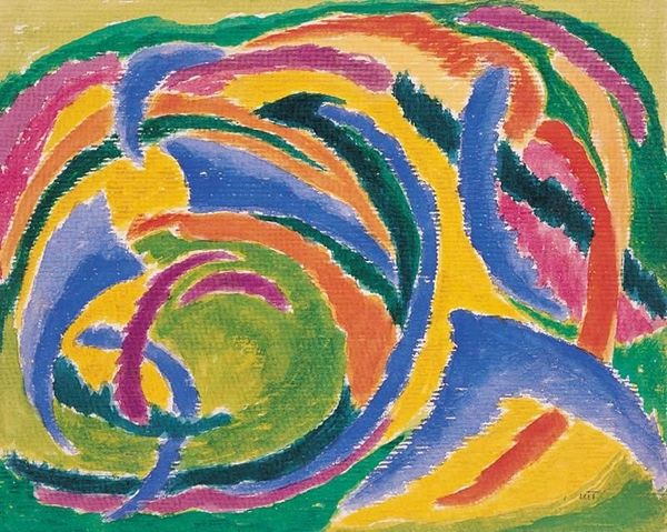
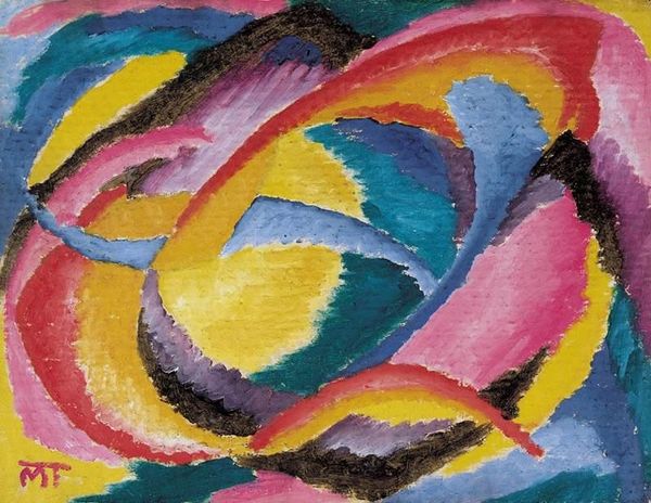
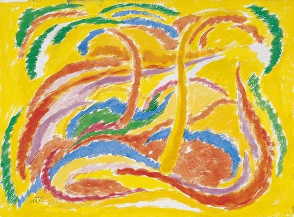
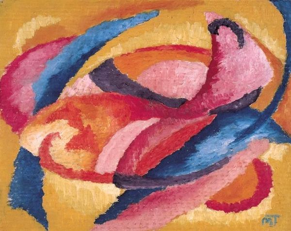
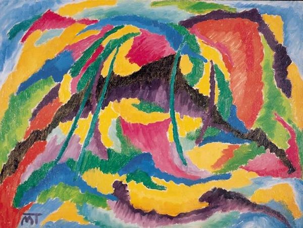
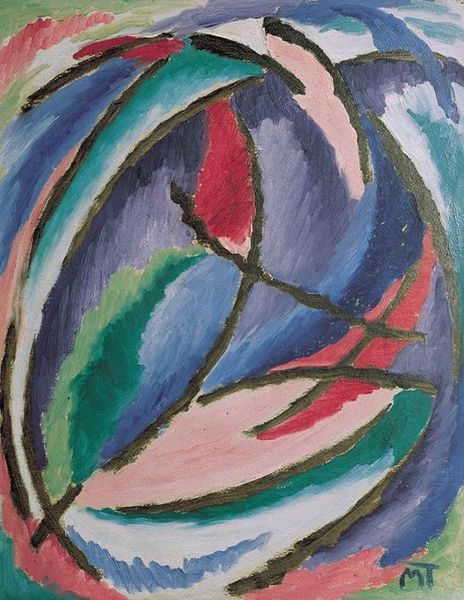
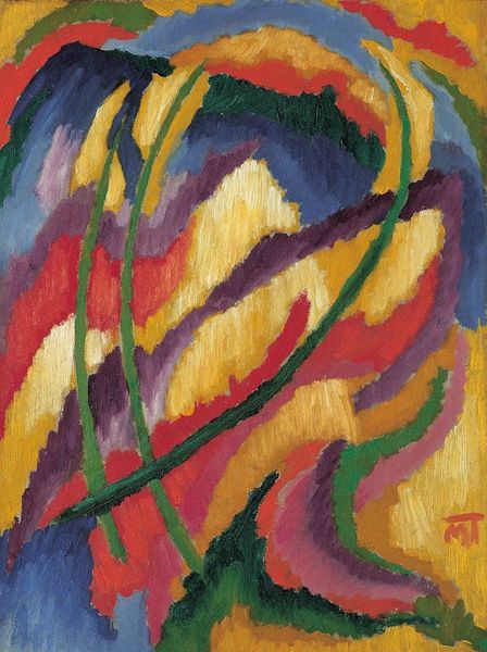
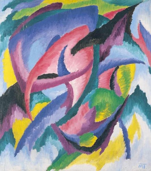
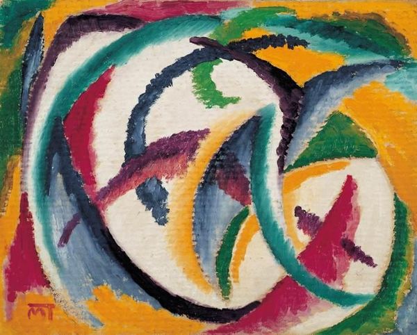
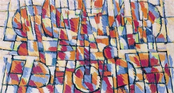
Editor: This is Janos Mattis-Teutsch's "Composition," created in 1919 using watercolor. The colors feel so vibrant and swirling. It's like looking into a kaleidoscope. What do you see in this piece, looking at it purely from a formal perspective? Curator: Indeed. Let us consider the artist's meticulous arrangement of lines and colors, their pure visual qualities. Note the interplay of curved versus straight lines; the cool blues juxtaposed against the fiery reds and oranges. The forms don't immediately resolve into recognizable shapes, but contribute instead to an overall sense of dynamic energy. What strikes you about the spatial organization? Editor: The colors overlap and intersect which confuses any sense of depth. There are shapes within shapes, but my eyes dart all over! Curator: Precisely! Mattis-Teutsch deliberately disrupts traditional perspective. See how the composition pulls the eye in several directions simultaneously? It is not trying to be "real", but rather evoke feelings through its arrangement of abstract elements. Observe also the varying intensity of the watercolor washes; the layering suggests depth even without clear form. Editor: So, it's all about how the shapes and colors relate to each other, not what they represent? Curator: Precisely! It is through the relationship of these intrinsic visual elements that we find meaning. What would you say is the overall mood, observing only these aspects? Editor: I guess it's chaotic, but also kind of joyous. The colors are too bright for it to be depressing. Curator: I would concur. I find this close reading has made the piece far more vibrant. Editor: Me too! I didn't know abstract art could be this engaging on a purely visual level.
Comments
No comments
Be the first to comment and join the conversation on the ultimate creative platform.
More like this