graphic-art, print, typography
#
portrait
#
graphic-art
# print
#
typography
#
decorative-art
#
modernism
Dimensions: height 180 mm, width 105 mm
Copyright: Rijks Museum: Open Domain
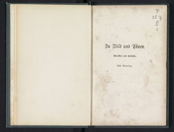
Curator: Here we have the title page for J.J. van der Horst's "Nederlandsche Verhalen," or "Dutch Stories," from 1854. It's a print from C.L. van Langenhuysen, the publisher in Amsterdam, and it notes that the book contains four copper etchings by J. van Dyck. Editor: It's deceptively simple, isn't it? The lettering and embellishment feel restrained, yet dignified. It evokes a sense of well-ordered narrative, the kind you’d expect from a clergyman, perhaps. Curator: Exactly. Context is crucial. Van der Horst was indeed a Catholic priest in Haarlem. So the “Dutch Stories” are viewed through the lens of religious instruction and moral teachings of that time. This explains the subdued ornamentation. A lavish title page would feel incongruous to the contents. Editor: The printer used a somewhat heavier font for the word "Nederlandsche Verhalen." Does it function symbolically as the central theme that supports the personal details underneath? The ornamental typographic element separating the author and the printer - is that merely a flourish? Curator: Not merely. The typographic ornaments served a dual purpose. Decoratively, they added visual interest. Functionally, they aided readability, directing the eye and creating a hierarchy of information within the composition of the page itself. Editor: So even in something seemingly utilitarian like a title page, visual symbols play their part in establishing expectations and subtly guiding the reader's experience. There is an honesty, a directness about it. No excessive visual spectacle - the content seems to be what matters most here. Curator: Indeed. The publication reflects the sensibilities of the rising middle class who sought not ostentation but clear narratives that resonated with their values and their expectations regarding the role of religious and moral storytelling in Dutch society. The imagery may be muted, but it tells a distinct tale about Dutch life. Editor: I’ll admit I didn't expect to find so much quiet intensity within something so simple. Curator: Well, that’s the fascinating part of delving into these seemingly minor artifacts. They provide remarkable insight into a specific time and its cultural values.
Comments
No comments
Be the first to comment and join the conversation on the ultimate creative platform.
More like this