Dimensions: height 18.4 cm, width 18.2 cm
Copyright: Rijks Museum: Open Domain
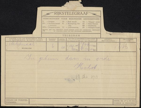
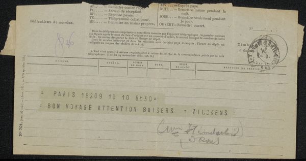
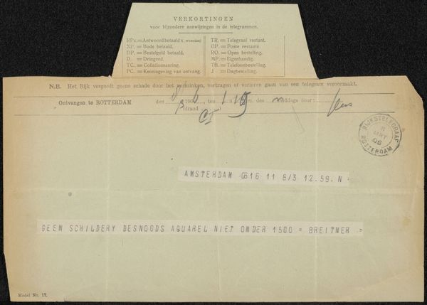
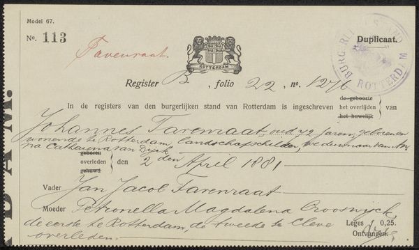
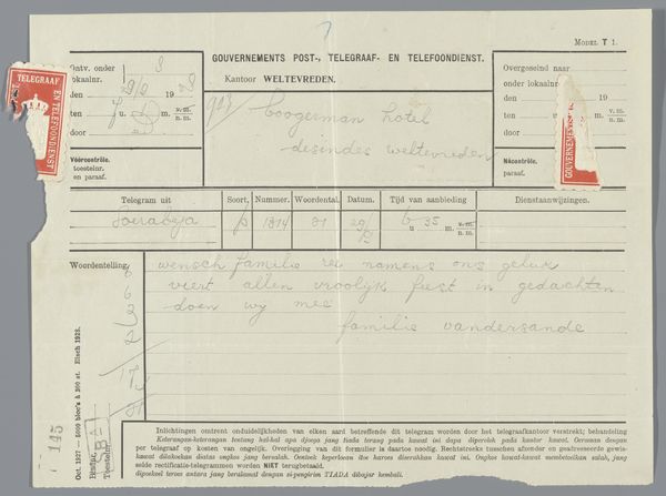
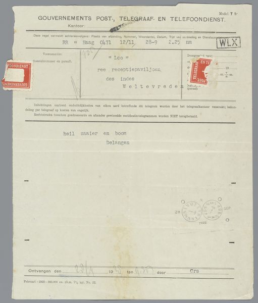
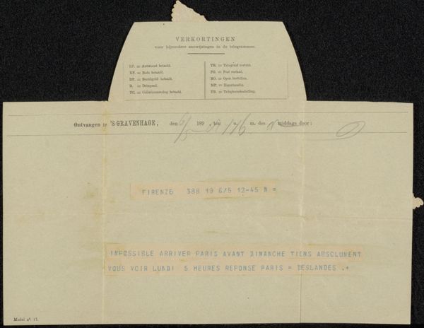
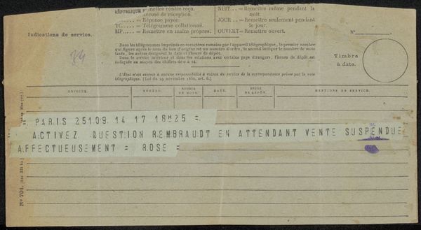
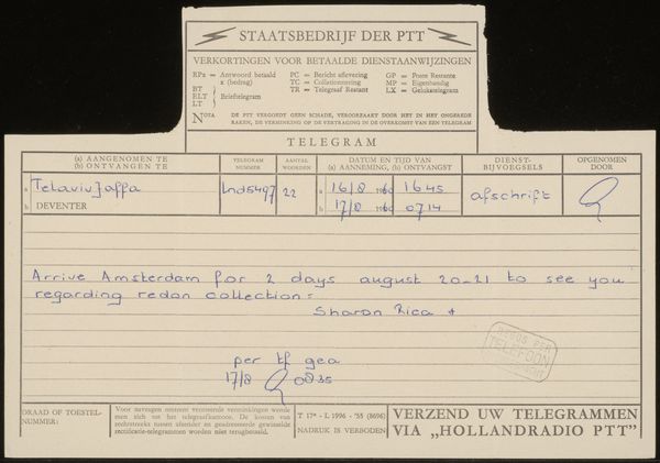
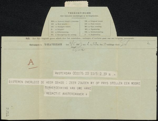
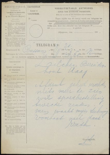
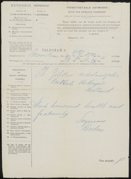
Editor: This document, titled "Customs and Excise," looks to be from around 1940-1945. It's on paper, aged and faded. The handwritten script gives it a stark feel. It’s quite minimal, focusing only on the bare details, but there’s also a fragility to it. How do you interpret this work solely based on what you see? Curator: Ignoring external references for a moment, note how the formal elements work in concert. The aged paper contributes to the document’s flat visual field, broken only by geometric shapes in the ruled lines. The geometric rigidity opposes the organic handwriting. Is there an overall balance? Editor: Yes, the script and line structure do fight for dominance, almost as if they are having a conversation through a contrast of free and precise lines. How would that play into how we examine this document? Curator: Observe the pale palette—a deliberate aesthetic choice? Or an inevitability caused by fading ink? Whether accidental or intentional, it serves to deemphasize detail, foregrounding the composition’s raw structure and form. Editor: Interesting. It appears someone had to painstakingly fill in details of rifles, revolvers and ammunition to fit this form, thus submitting their writing and authority to a form. It seems a tension between individual information and public regulation! Curator: Indeed, how fascinating to see these considerations only through the lens of form and visual balance, as we intentionally set aside all external knowledge! This creates space for visual investigation.
Comments
No comments
Be the first to comment and join the conversation on the ultimate creative platform.
More like this