drawing, paper, ink
#
portrait
#
drawing
#
hand-lettering
#
typeface
#
hand drawn type
#
hand lettering
#
paper
#
ink
#
hand-written
#
fading type
#
stylized text
#
thick font
#
typography style
#
handwritten font
#
calligraphy
Copyright: Rijks Museum: Open Domain
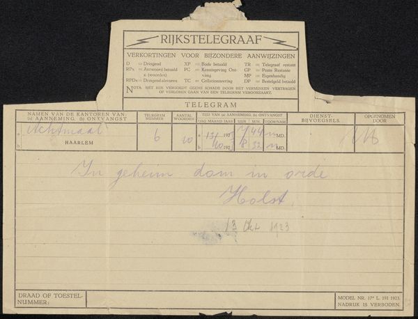
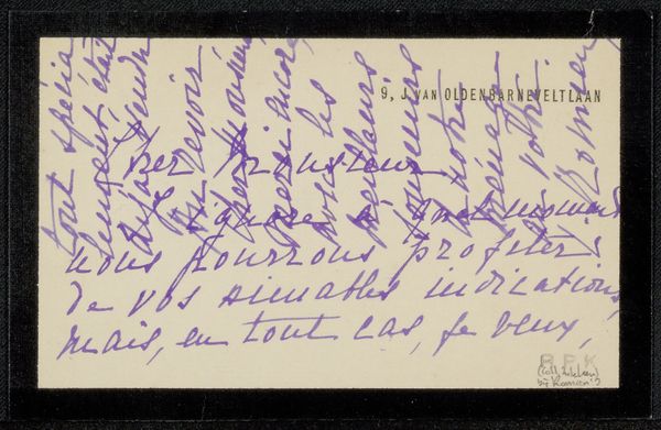
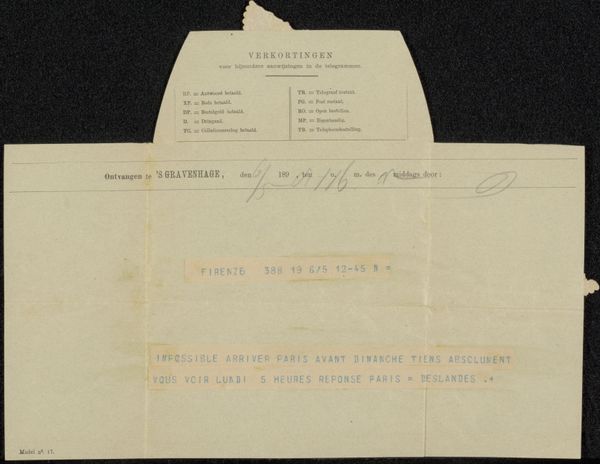
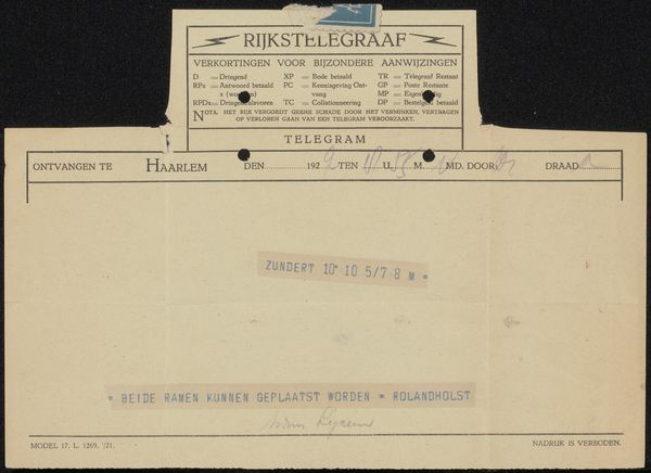
Curator: Let’s look at this “Telegram aan Pieter Haverkorn van Rijsewijk,” likely from 1911, created by Theo Colenbrander. It's ink on paper, essentially a handwritten message. What strikes you immediately? Editor: The visual simplicity is compelling. The composition is quite linear, dictated by the telegram form, and the handwriting… it feels both urgent and personal, creating an interesting tension. Curator: I agree. Knowing Colenbrander's broader artistic context is essential here. He was deeply embedded in the Dutch decorative arts movement, actively working to create artwork for, and cultivate an appreciation among, a wide public audience. In the cultural climate of the time, accessible forms of communication such as this telegram played an important role in bringing art to everyday life. Editor: Right, the formal qualities of the typography can be understood through a semiotic lens. Look at the thick font and stylized text, these elements of hand-lettering, the weight of the lines, all contributing to its immediate legibility but also imbuing it with artistic intention beyond pure utility. The fading typeface almost underscores this transition into an artifact of the past. Curator: Exactly. I’m intrigued by the brevity and the message. "Met moreel bevriend, heb niets gelezen. Brief volgt”..."In good spirits, haven’t read anything. Letter to follow." Consider the social dynamics. There's a power imbalance here; Colenbrander controls information, keeps someone waiting. The telegram itself then becomes not only a functional instrument, but a commentary on the anxiety produced in communication within specific hierarchical contexts. Editor: Hmm, I still am most interested in the fact that a supposedly 'cold' and purely functional communication like a telegram has been re-appropriated here to make something distinctly aesthetic out of it. Colenbrander treats it as a compositional challenge and turns it into this curious artwork through the quality of his handwriting and how that interplays with the standardised printed forms. Curator: That speaks to the core of his oeuvre—blending utility with artistic flair. Thanks, I can certainly see and appreciate this work differently after considering our observations today. Editor: My pleasure. The piece has also made me reconsider my own prejudices towards what might qualify as 'artistic' vs. 'functional'. It goes to show, really, that looking carefully matters.
Comments
No comments
Be the first to comment and join the conversation on the ultimate creative platform.
More like this