paper, ink
#
paper
#
ink
#
calligraphy
Copyright: Rijks Museum: Open Domain
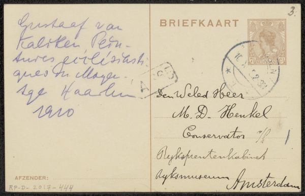
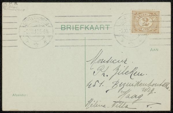
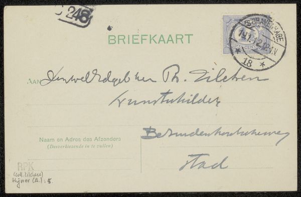
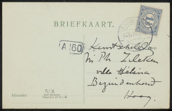
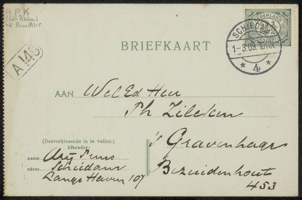
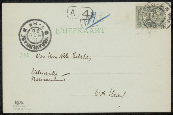
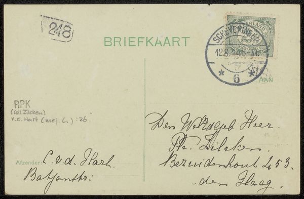
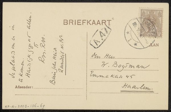
Curator: We're looking at a vintage postcard, entitled "Briefkaart aan Max Dittmar Henkel," believed to be from around 1925, crafted by Jacobus Henricus Maria Hagen. The materials used are paper and ink, showcasing a beautiful sample of calligraphy. Editor: Immediately, I'm struck by the elegance of the cursive script against the stark simplicity of the card. There's a pleasing rhythm to the descending loops and the evenness of the line weight. Curator: Indeed, Hagen's skill is evident, but let's consider the historical context. Max Dittmar Henkel was a conservator at the Rijksmuseum’s print cabinet in Amsterdam, and this postcard offers us a glimpse into the professional circles of the Dutch art world during that period. We see the formal address: "Den Weled Heer", literally "The Esteemed Mr.". Editor: Absolutely, the careful penmanship certainly speaks to a certain level of formality and respect between colleagues. But, considering the design, what about the stamp and the printed aspects? Curator: The “Briefkaart” heading indicates a standardised format dictated by postal regulations. The placement of the Vaassen postal stamp and the sender’s details suggest a system geared towards efficient communication. These details situate Hagen's artwork within the postal system. The stamp tells us something too. The location suggests that the sender may have lived there, or the place the mail passed through. Editor: Agreed. What I find intriguing is the interplay between the mechanised aspects of printing and the handmade nature of the handwriting. This friction adds layers, transforming a simple piece of correspondence into a historical document. The contrast in type hints to its industrial mode. Curator: Exactly! The postcard isn’t just a message; it’s an artefact embodying social practices and communication norms of its time. It subtly alludes to Hagen’s societal and artistic place within Amsterdam's art scene. Editor: Looking closer, there is also a certain incompleteness; on the front where an image might be present, instead there’s the trace of a redacted or censored aspect on the other panel with “4 365”, that prompts curiosity. Curator: That's a thought-provoking observation. Considering it was post-World War 1 and the rise of new socio-political factors influencing art, these number sequences may also hold important implications, particularly considering Hagen was writing to a Rijksmuseum worker. It all becomes interconnected! Editor: So, it transforms a momentary glimpse into this small world where Hagen created work during this period in Dutch society. Curator: Precisely! Editor: Hagen offers much to delve into.
Comments
No comments
Be the first to comment and join the conversation on the ultimate creative platform.
More like this