drawing, paper, pen
#
drawing
#
script typography
#
hand-lettering
#
thick colouring
#
hand drawn type
#
hand lettering
#
paper
#
personal sketchbook
#
hand-drawn typeface
#
intimism
#
fading type
#
sketchbook drawing
#
pen
#
handwritten font
Copyright: Rijks Museum: Open Domain
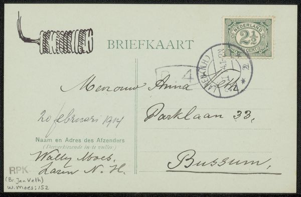
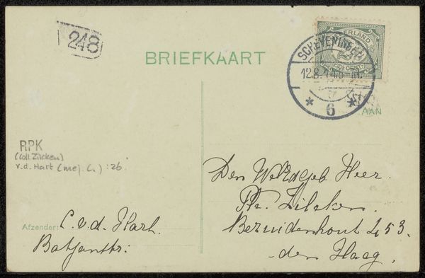
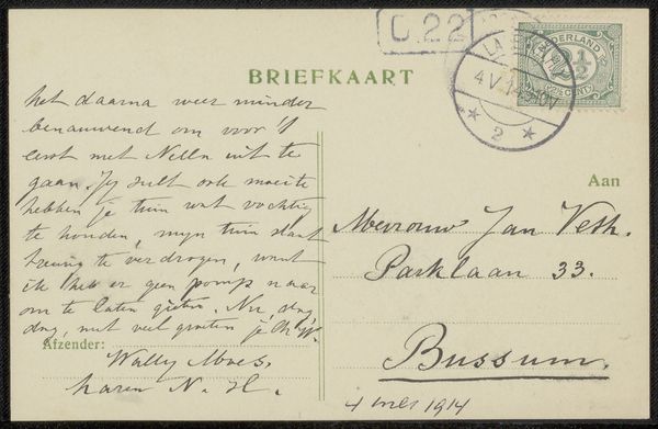
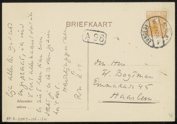
This “Briefkaart aan Jan Veth” was made by Wally Moes, around 1916. It's got that pale, washed-out green, typical of postcards from that time, and the handwriting fades in and out, like a whisper from the past. The whole thing feels so immediate and human, like a quick sketch dashed off on a whim. Look at the way the stamp is slapped on, the postmark smudging the edges – it's less about perfection and more about getting the message across, right? The texture of the card itself, probably smooth and slightly glossy, adds to that sense of intimacy. You can almost feel the writer’s hand moving across the surface, leaving traces of thought behind. I always find the best paintings, like the best postcards, are palimpsests; they are layers of thought, obscured and reformed. It makes me think of Agnes Martin, how she used the grid to create a sense of calm and order, but with this underlying vulnerability, like a breath held tight. In the end, it's all just marks on a surface, a conversation between one person and another, stretched across time and space.
Comments
No comments
Be the first to comment and join the conversation on the ultimate creative platform.
More like this