drawing, paper, ink
#
drawing
#
script typography
#
ink paper printed
#
hand drawn type
#
personal journal design
#
paper
#
personal sketchbook
#
ink
#
hand-drawn typeface
#
fading type
#
ink colored
#
sketchbook drawing
#
sketchbook art
Copyright: Rijks Museum: Open Domain
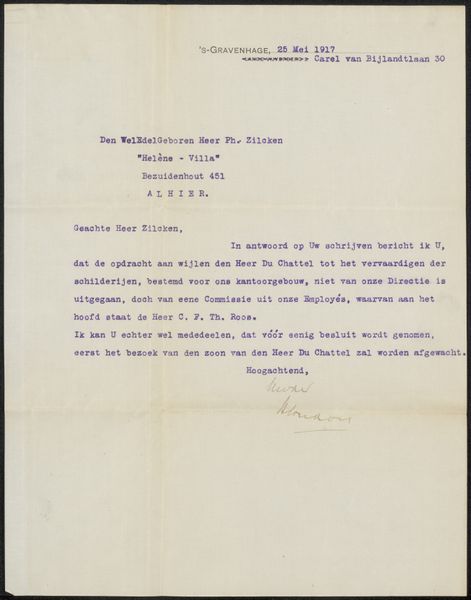
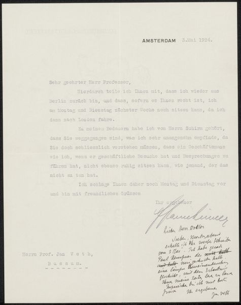
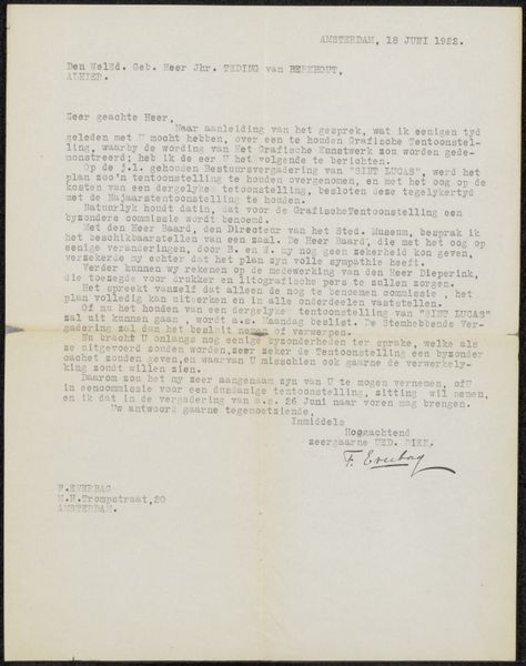
Editor: So, here we have "Brief aan Philip Zilcken," possibly from 1914, by Frederik van Eeden. It's ink on paper and housed in the Rijksmuseum. What strikes me is the contrasting formality of the typed text with the intimacy of the handwritten signature. What do you see in the way van Eeden composes this letter? Curator: Observe how the artist juxtaposes the impersonal mechanical precision of the typewriter with the organic flow of his signature. The typed text establishes a formal tone. It sets a structured grid upon which the eye moves. However, the cursive signature disrupts that rigid structure, reasserting the individual hand, the unique gesture. Consider the very materiality: the stark black ink against the flat, neutral ground of the paper. Editor: I see that, the signature does stand out more now. Is there anything significant about where he places the signature, in relation to the text? Curator: Note the spatial arrangement. The body of the text occupies the upper left quadrant, while the signature resides in the lower right, creating a visual tension. It’s almost as though the formal communication precedes and enables the personal touch. Consider, too, the implied lines that connect these two visual elements – the flow of communication itself. Editor: So it’s like the official and the personal are two distinct elements brought together on the same plane? Curator: Precisely. It's an interesting interplay. One could even consider the blank space surrounding the text and signature as an active element in the composition. The whiteness amplifies the textual components, drawing the eye towards the message itself, and that final, personal mark. The date acts almost as an anchor point for the reading eye, a structured moment in time from which to perceive the textual contents. Editor: That gives me a new way to appreciate this simple letter. Seeing it as a structured composition rather than just a historical document makes it even more engaging. Curator: Indeed, through analyzing its formal elements, we find deeper meaning and artistry embedded within what initially appears to be a standard piece of correspondence.
Comments
No comments
Be the first to comment and join the conversation on the ultimate creative platform.
More like this