print, paper, typography
#
ink paper printed
# print
#
paper
#
typography
#
modernism
Copyright: Rijks Museum: Open Domain
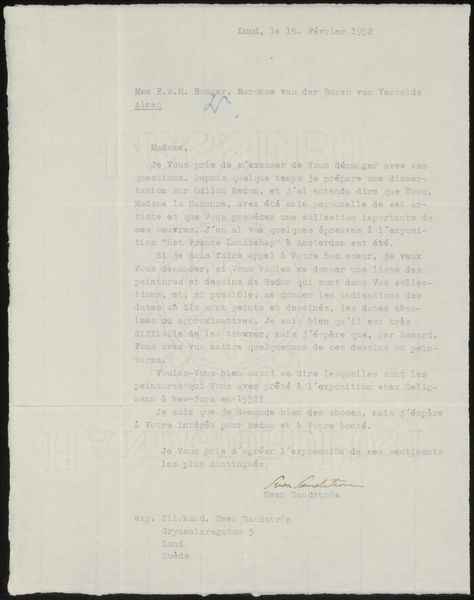
Curator: Editor: This printed letter, “Brief aan Françoise W.M. Bonger,” possibly from 1947, feels quite bureaucratic, yet the modernist typography lends it a stark kind of beauty. The neat, dense blocks of text create interesting shapes on the page. What draws your attention in this piece? Curator: The immediate thing that strikes me is the spatial organisation of the typographic elements. Consider how the placement of the header - ‘Ministerie van Onderwijs, Kunsten en Wetenschappen’ - dictates the arrangement below. Then, think about the relationships established by the various margins. The signature adds a gestural element too, breaking up the geometrical grid. Editor: So, you see the layout and typography as the most significant artistic components? The arrangement of text as a design element. Curator: Precisely. It uses typographic forms and the considered application of them to the support, the paper itself, to produce its signifying function, one layered onto its documentary one. Does this reading resonate for you? Editor: It does. Focusing on those purely visual aspects lets me appreciate it beyond its original function. Thank you. Curator: A letter then serves a purpose beyond information conveyance when you allow the formal elements to do their work on you as a viewer.
Comments
No comments
Be the first to comment and join the conversation on the ultimate creative platform.
More like this