drawing, paper
#
drawing
#
script typography
#
hand-lettering
#
hand drawn type
#
feminine typography
#
hand lettering
#
paper
#
personal sketchbook
#
hand-drawn typeface
#
fading type
#
thick font
#
sketchbook art
#
calligraphy
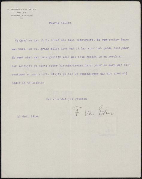
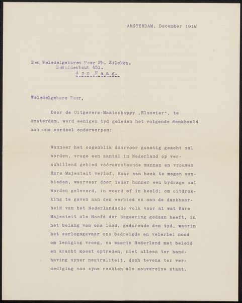
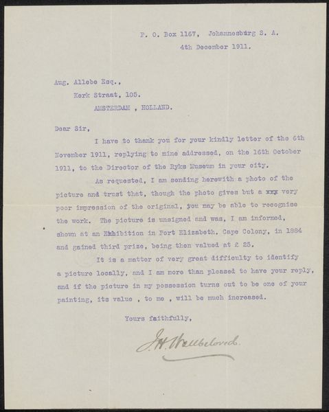
Copyright: Rijks Museum: Open Domain
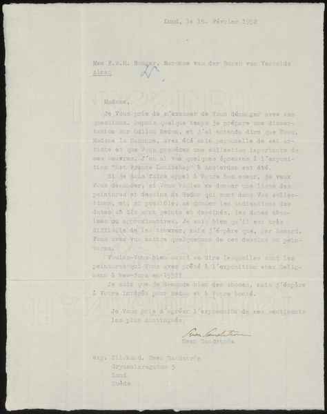
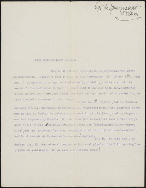
Curator: Here we have "Brief aan Philip Zilcken," possibly created in 1917, by Hugo Loudon. It’s a drawing on paper featuring detailed calligraphy. What strikes you immediately? Editor: The text has such a formal tone and clear structure, even for the letter of the day. I almost want to say that there is a certain feeling that there's something unsaid between the lines, like coded messages or concealed intentions. Curator: Letters served as official records, expressions of sentiment, business transactions... Their societal role was enormous, their formality reflected social hierarchies of the day. Think of the intricate protocols and social etiquette surrounding correspondence! Hugo Loudon, writing this to Philip Zilcken, acknowledges previous correspondence and explains how a commission for paintings is being handled. The letter’s creation becomes tied to a decision-making process, which provides unique insight into that decision’s bureaucratic culture and societal structure. Editor: Right. I was drawn to how the visual appearance echoes that formality, it is precise, as well as clear; which seems reflective of those structured conventions of writing that you have referenced. Even down to the handwriting itself, so perfect, as if printed or engraved! You said calligraphy, how far would you take that categorisation, as it could easily just be referred to as cursive or careful handwriting, even? Curator: Calling it calligraphy underscores its elevated design elements and intention behind how the artist has used fonts. Though handwritten, each word seems crafted. It exists somewhere in the interplay between functional writing and formal artistic presentation, therefore making calligraphy not a bad designation, in this case. Perhaps that designation then adds, for me, to this concept of unsaid intention between the lines? I also consider who Zilcken might have been, and their role in these structures and systems we talk of. Editor: Definitely! The level of care devoted to writing that elevates beyond simple transcription speaks volumes about the values placed on correspondence, communication and record, at this point in time. Letters being read again and again and held onto… Thank you for sharing your expertise and insights, this has been such a fruitful conversation! Curator: Indeed, looking closely at what appears to be the remnants of such an unassuming object has proved to be extremely rewarding. Thank you for your contribution.
Comments
No comments
Be the first to comment and join the conversation on the ultimate creative platform.
More like this