#
neo-pop
Copyright: Keith Haring,Fair Use
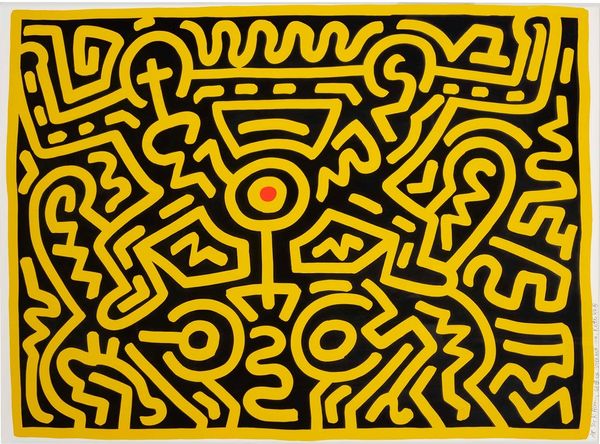
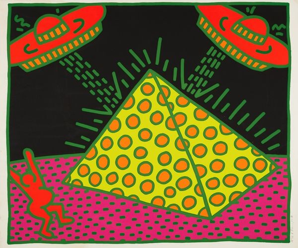
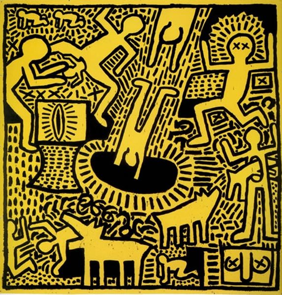
Keith Haring made this untitled piece, sometime before 1990, using bold, graphic shapes and a striking yellow and red color scheme. It’s kind of amazing how he boils everything down to the essentials, right? Looking at it, you see the flat surface, almost like a sign, but then you notice the tiny dots filling in the space, like someone took a marker and just went wild. That texture creates a kind of buzz, a vibration, that makes the whole thing pop. There’s a figure diving in, another leaping out, and some playful dolphins, all outlined in red against that sunny yellow. Haring's lines aren't precious; they're raw and full of energy. This piece is so characteristic of his signature style, reminiscent of his subway drawings. He reminds me a bit of Dubuffet. Both artists used a pared down language to express a certain freedom. It's a reminder that art doesn't always have to be serious or complicated. Sometimes, the simplest gestures can say the most.
Comments
No comments
Be the first to comment and join the conversation on the ultimate creative platform.
More like this