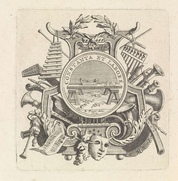
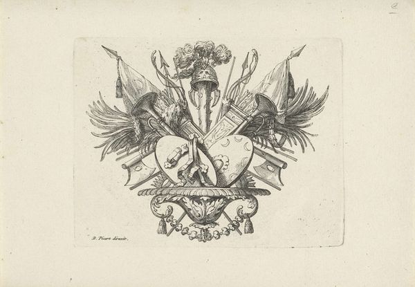
graphic-art, print, engraving
#
graphic-art
#
neoclacissism
# print
#
history-painting
#
engraving
Dimensions: height 114 mm, width 135 mm
Copyright: Rijks Museum: Open Domain
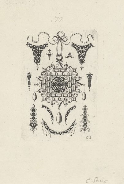
Editor: We’re looking at "Vignet van het commandement van Amsterdam, 1795," a print by Theodoor Koning. The monochromatic engraving style lends it a stark, graphic quality. There's a central oval design filled with imagery, flanked by cannons and flags. How do you read the arrangement of objects in this print, formally speaking? Curator: The composition is certainly deliberate. We see an oval cartouche at the center, densely packed with allegorical figures and inscriptions that interrupt a unified field of vision. Flanking this are arranged objects evoking civic authority. The formal arrangement suggests a hierarchical structure—an emphasis on stability through symmetry. What purpose do you think that might serve? Editor: Possibly to reinforce a sense of order and power during a time of potential political upheaval? It's interesting how the delicate engraving contrasts with the rather assertive subject matter. Curator: Precisely. Notice the strategic use of light and shadow – particularly the radiating lines emanating from behind the cartouche. It draws the eye and adds a sense of dynamism to an otherwise static composition. Consider how those formal elements serve to communicate intended ideas. Editor: So the artist is using formal elements to make an argument? Curator: Indeed. Koning orchestrates a play of textures and light. Do you notice any points of tension or visual discord? These elements invite us to consider a variety of potential viewpoints and underlying meanings in this single work. Editor: I see that, now. Thanks for pointing it out!
Comments
No comments
Be the first to comment and join the conversation on the ultimate creative platform.
More like this