Dimensions: height 140 mm, width 160 mm
Copyright: Rijks Museum: Open Domain
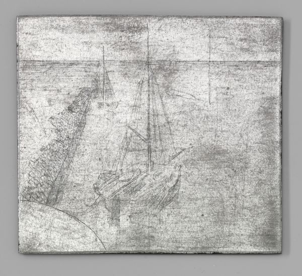
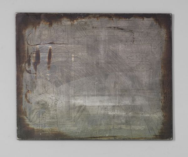
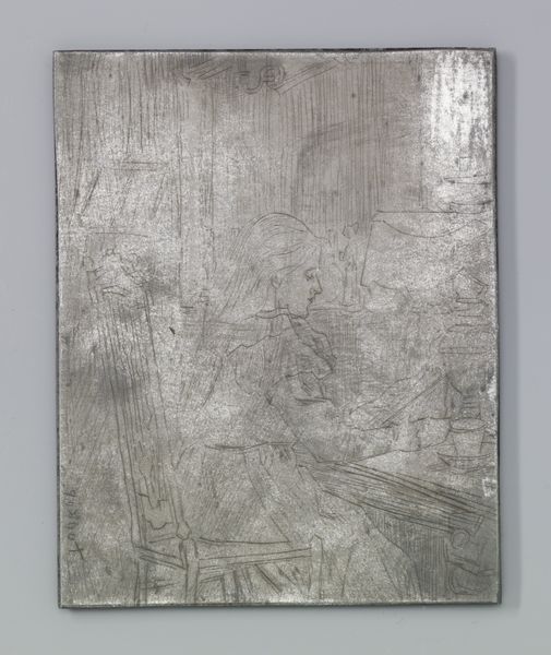
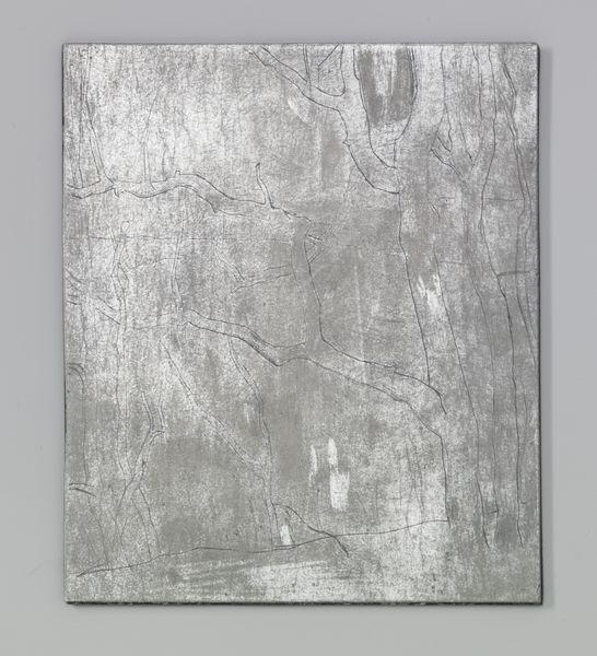
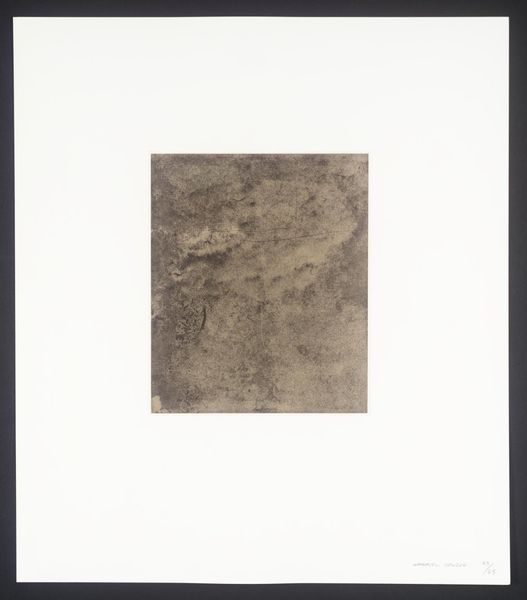
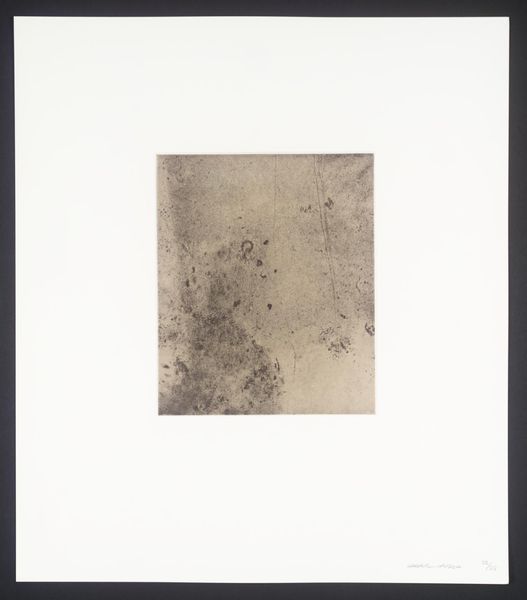
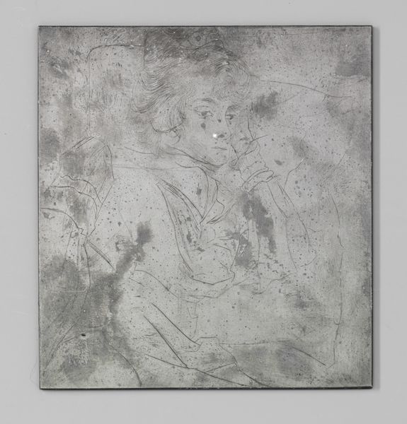
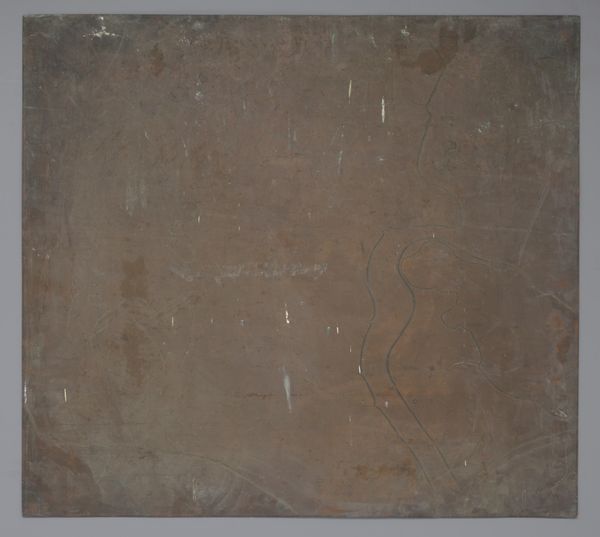
Curator: This etching, "Kanaal bij Katwijk aan Zee," was created by Jan Toorop around 1901. Look closely at the delicate lines achieved using a metal plate; it's now part of the Rijksmuseum's collection. Editor: The overall effect is overwhelmingly gray. There is something both industrial and natural about the stark, almost photographic feel that I can't put my finger on. What would you say? Curator: Interesting. I see, beyond a topographical depiction, something of an attempt to depict the transition of Dutch society and tradition; the etched metal acts as a signifier of these transitions. The waterways, an icon of commerce and passage for centuries in Holland, are rendered almost ghost-like, as if they are fading into industrial modernity. Editor: Fading... yes, the etching work, almost like hurried sketches, contribute to that ephemeral quality. But do these impressionistic renderings indicate Toorop sought merely to depict the industrialization? What if, say, it was purely an investigation of texture, of light playing on water and the sky reflecting on metallic surfaces? It feels fundamentally aesthetic, driven by sensation over symbolism. Curator: That’s valid; however, you cannot dismiss Katwijk’s historical role as both a fishing village and a crucial point for naval activity; such spaces carried the hopes and anxieties of Dutch maritime culture. By reducing this bustling activity into subtle grey textures, the work almost feels melancholic, laden with a sense of historical awareness. I would propose the light isn't arbitrary but represents a vanishing cultural history. Editor: Hmm... but even if the subject holds that symbolic weight, the style suggests an emphasis on immediate sensory perception over long-held cultural memories. It doesn’t demand you reflect. Curator: Fair, but the symbolic can emerge precisely *through* the sensory. What's rendered and, perhaps even more crucially, *how* it's rendered communicates volumes, beyond simply capturing what is visible. The impressionistic style itself speaks to that break. Editor: An interesting angle. Considering the weight we have placed on form versus symbol, there’s clearly much to unpack regarding its depiction and its legacy.
Comments
No comments
Be the first to comment and join the conversation on the ultimate creative platform.
More like this