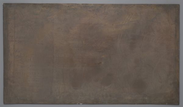
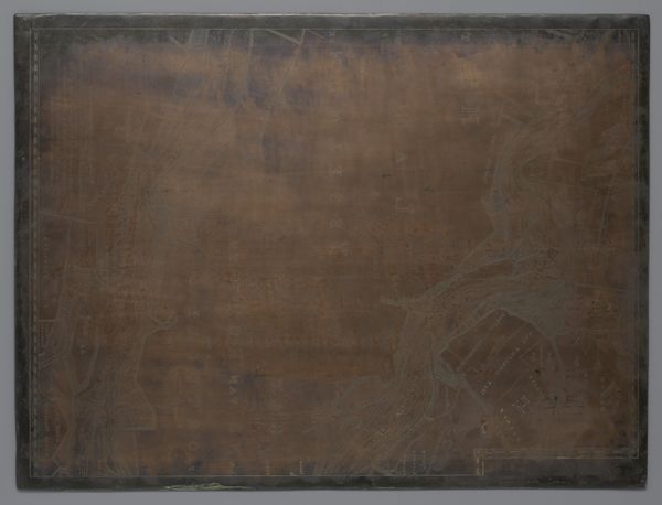
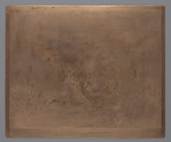
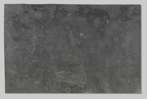
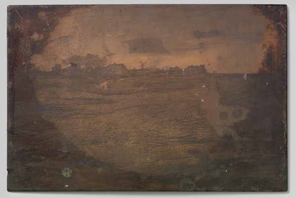
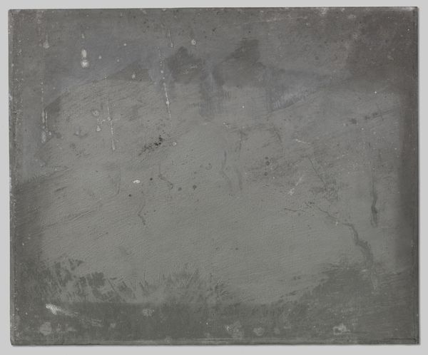
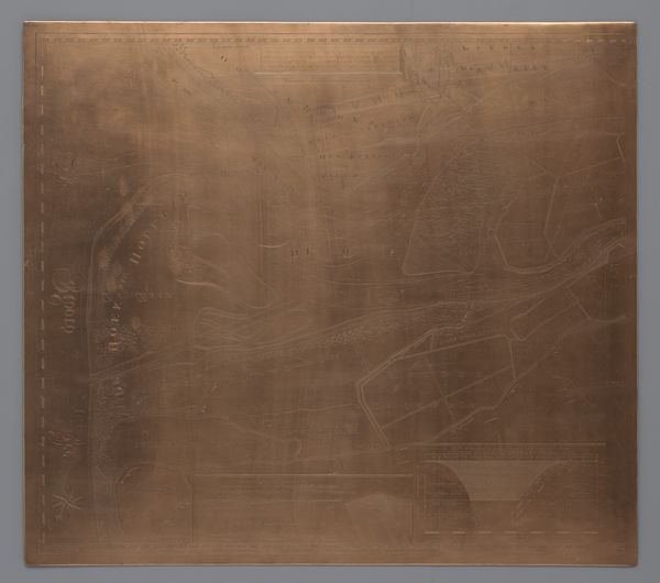
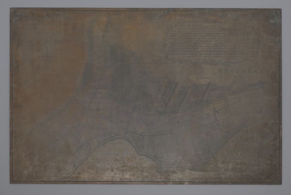
Koperplaat met een kaart van het gebied tussen Wieringen en Callantsoog 1672
0:00
0:00
frederikdewit
Rijksmuseum
graphic-art, print, engraving
#
graphic-art
#
baroque
# print
#
line
#
engraving
Dimensions: height 788 mm, width 870 mm
Copyright: Rijks Museum: Open Domain
Curator: Oh, hello. I’m drawn to this Koperplaat, this copperplate from 1672. It's actually a map of the area between Wieringen and Callantsoog, attributed to Frederik de Wit and housed right here in the Rijksmuseum. What strikes you first about this piece? Editor: Immediately, I see the stark contrast between its intended purpose, mapping a territory, and what feels like its quiet, almost haunted, presence. It’s like a mirror reflecting time and memory, less about topography and more about the ghost of creation. Curator: Yes, the way the lines are etched, so deliberate yet yielding to the copper’s own story—its patina and imperfections. It was made to produce prints, multiples intended to inform and navigate, but here it is, singular and mute, as if keeping secrets. Editor: Right, think about maps in general; they’re never neutral. They embody power, exploration, ownership… Even today, a cartographer embeds their biases and viewpoints. And here we have a piece frozen between intention and outcome. Is it the representation or the object that holds more power? Curator: Perhaps it’s the residue of the creative act, the anticipation held within the metal. Each scratch and engraving carries an intention that transforms the flat surface into a container of potential. Imagine the hand that guided the burin, the weight of knowing how lives and fortunes relied on such documents. Editor: The copper itself adds a layer of symbolism too, doesn’t it? Copper connects to Aphrodite, alchemy, transformation. And look at the stark lines; a stark almost violent commitment that contrasts the fluidity it hopes to capture in mapping water. There’s something poignant about capturing fluidity with brutal strokes. Curator: It's lovely you noticed this contrast because there is beauty in knowing that something so fixed could represent a reality that is anything but static. Looking at it now makes me appreciate how it is almost timeless, transcending utility and morphing into an emblem of human effort and perception. Editor: It really reframes how we think about precision versus interpretation; objectivity versus embedded assumptions. An almost perfect blend of intent and impact. Curator: I concur. It feels very present in a strange way.
Comments
No comments
Be the first to comment and join the conversation on the ultimate creative platform.
More like this