Copyright: Carmen Herrera,Fair Use
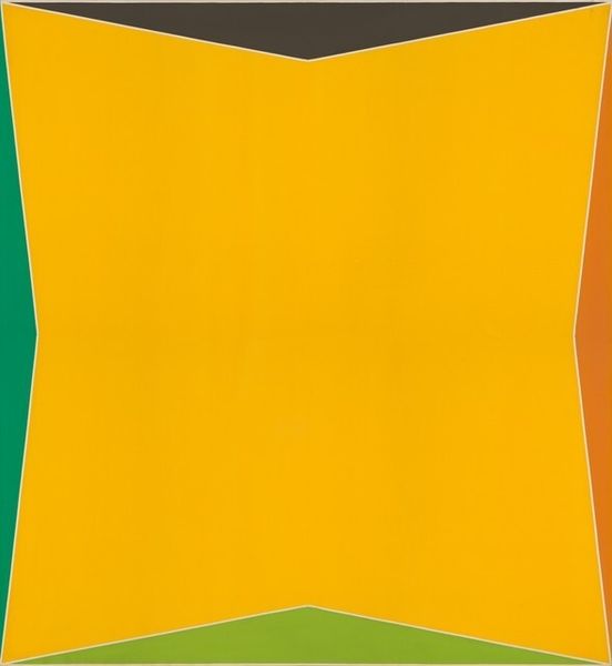
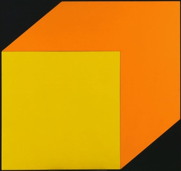
Carmen Herrera’s 'More yellow, less green' is an exercise in decision-making with paint. Looking at the surface, there’s a real flatness that almost feels like screen printing, but it’s paint, it’s always paint! The tension comes from how the green square nudges up against the larger yellow plane. The colors feel solid, almost stubborn, but the painting has a lightness because of its pared-down nature. It's easy to see this composition as a kind of conversation between two characters, with the green pushing against the yellow and the yellow, well, holding its ground, really. It reminds me a little of Sol LeWitt, but where he was all about systems, Herrera feels more intuitive, less fixed on rules. At the end of the day, painting is like that, always an experiment in how we see and feel the world.
Comments
No comments
Be the first to comment and join the conversation on the ultimate creative platform.
More like this