graphic-art, print, paper, typography
#
art-deco
#
graphic-art
# print
#
paper
#
typography
Dimensions: height 280 mm, width 210 mm, height 412 mm, width 210 mm
Copyright: Rijks Museum: Open Domain
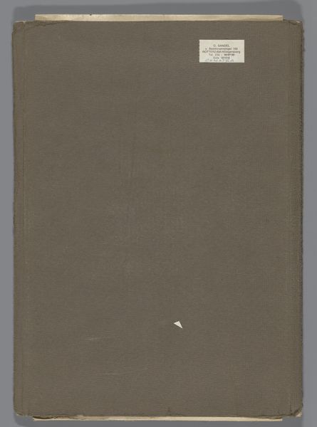
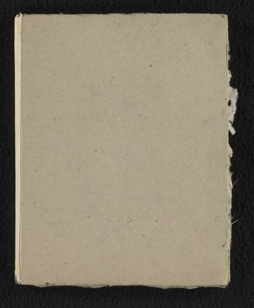
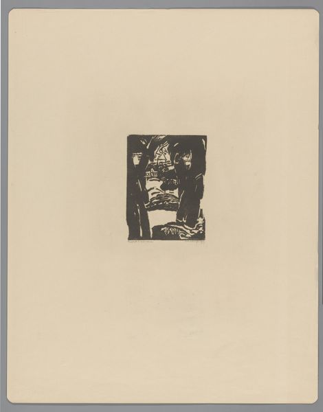
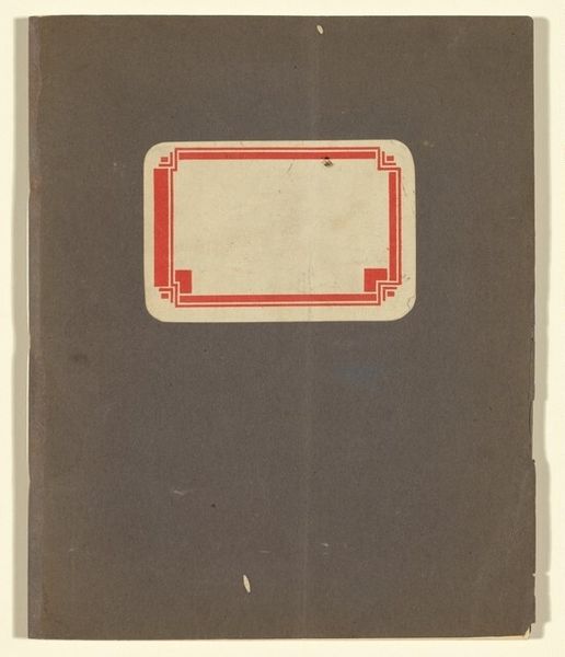
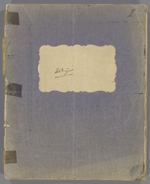
Curator: Here we have the "Jaarboek van de Nederlandse Exlibris-Kring 1936," the year book for the Dutch Exlibris society, printed in 1936. Exlibris translates literally to 'from the books' and is typically a small decorative print pasted into a book, usually on the inside front cover, to indicate ownership. It's a fantastic example of graphic art on paper. Editor: Immediately, I'm struck by the stark simplicity of this cover. The monochromatic palette emphasizes the contrast between the blank space and the centered black block, creating an aura of minimalistic design despite its somewhat decorative quality. It seems very much of its time. Curator: Indeed, the cover design exhibits distinct Art Deco influences, though stripped down to its most fundamental forms. These annual publications played a vital role in the artistic communities of the time, shaping networks and influencing broader design trends. The fact that the dates almost look like parts of a machine in a way is also fascinating given the larger socio-historical environment that was growing around the period. Editor: I’m curious about the symbolism, particularly the arrangement of the date. The almost stylized flower-like emblem at its center creates a sort of puzzle with these mechanical qualities. Curator: The symmetry and repetition certainly carry symbolic weight. These visual motifs are deeply embedded in the cultural anxieties of the time, balancing an almost idealized past with growing, mechanical modernization, which is even further explored through the act of owning art in book form. Editor: That brings up a very pertinent question: who were these societies for? Were they democratizing access to art or reifying the concept of art ownership as another status symbol for the middle and upper classes? Curator: That’s a very relevant question and something that often came up even internally within the group, to mixed conclusions. On the one hand, the exlibris itself made book ownership unique and signaled taste, wealth and privilege, however, it simultaneously did foster a kind of community through exchange and celebration of miniature artworks, like those contained in this yearbook. It should be noted that a yearbook of this kind served both functions! Editor: A duality inherent in much art produced within that time. Thank you, this has offered so much food for thought regarding the complexities interwoven into this design. Curator: Absolutely, and seeing how graphic design evolves to represent tensions between past and present remains fascinating.
Comments
No comments
Be the first to comment and join the conversation on the ultimate creative platform.
