painting, oil-paint
#
abstract-expressionism
#
non-objective-art
#
painting
#
oil-paint
#
colour-field-painting
#
form
#
geometric
#
abstraction
#
line
#
modernism
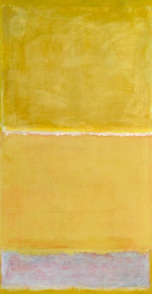
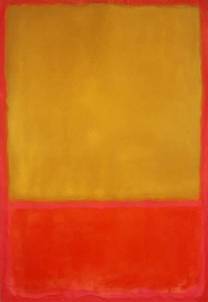
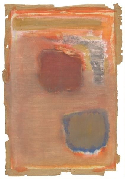
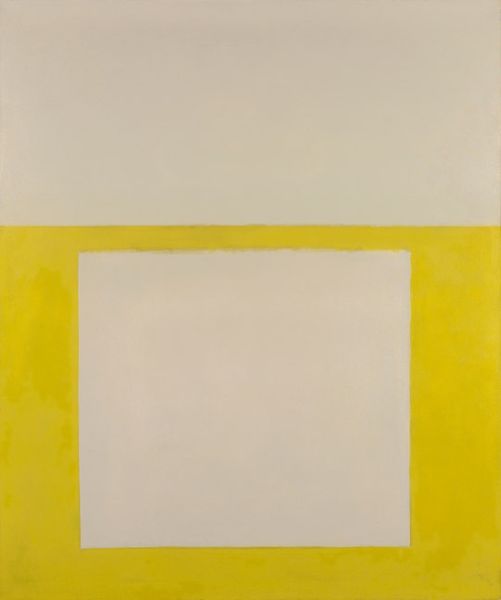
Copyright: Mark Rothko,Fair Use
Mark Rothko made No. 10 with oil paint in a way that feels less about making a picture and more about creating an experience. Rothko thinned his paints, layering colour upon colour; not trying to represent something, but instead trying to evoke feeling through fields of colour. Up close, you can see these aren't solid blocks. There's a surface, a texture. The paint is so thin it’s almost like looking at a stained canvas, where the colours bleed into each other. Look at the edges between the yellow and grey. Do you see how they're not sharp, but soft and blurry? That’s Rothko letting the colours mingle, creating a sense of depth, like the colours are floating. It’s like he's trying to capture the fleeting nature of emotions. Rothko’s work is like Barnett Newman or Clyfford Still in a way, but it pushes towards something else, a pure, almost spiritual experience. What does the painting say to you?
Comments
No comments
Be the first to comment and join the conversation on the ultimate creative platform.
More like this