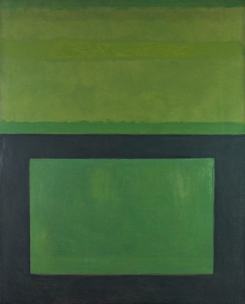
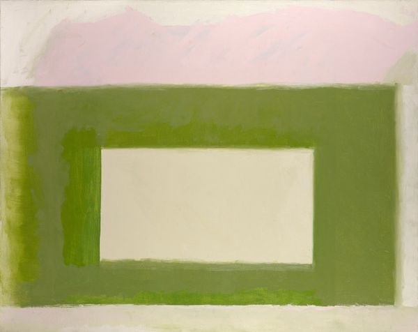
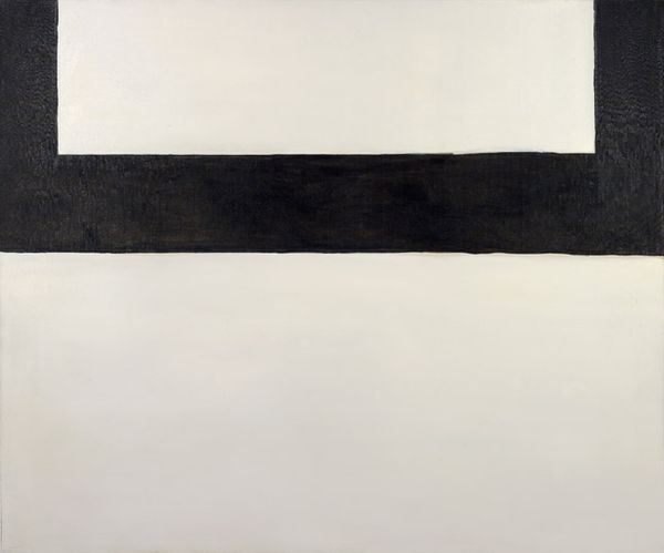
painting, acrylic-paint
abstract-expressionism
abstract expressionism
painting
acrylic-paint
acrylic on canvas
geometric
abstraction
modernism
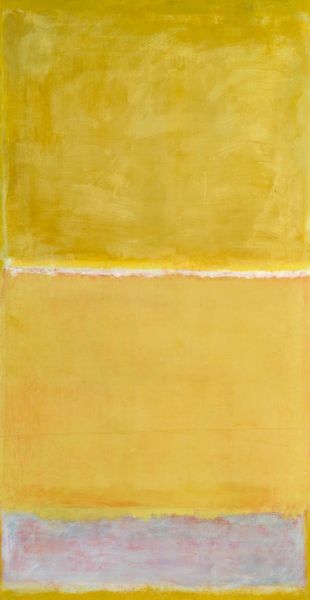
Copyright: Perle Fine,Fair Use
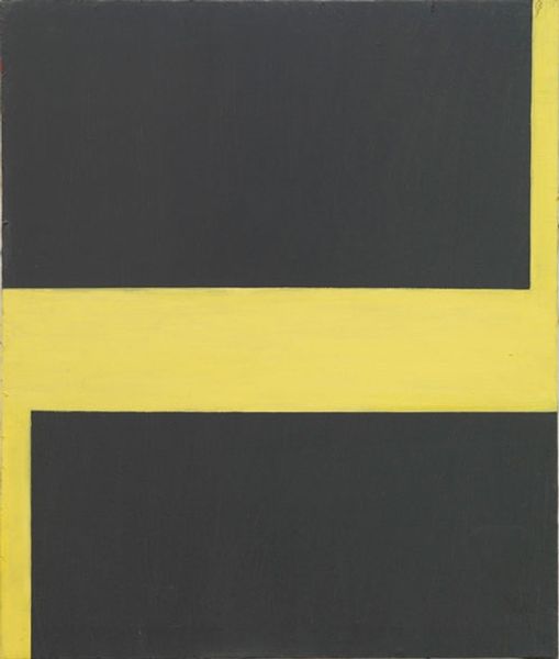
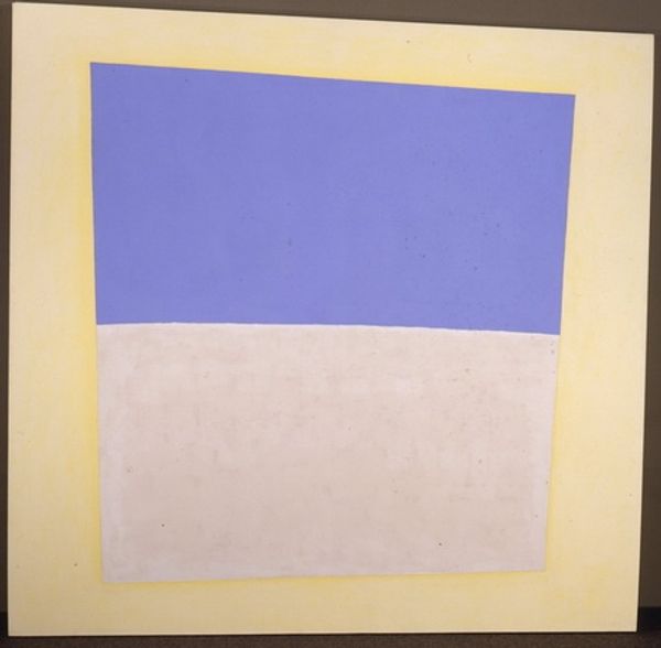
Curator: Standing before us is Perle Fine's "Cool" Series No. 2 (Yellow over Tan), an acrylic painting on canvas dating to 1963. What's your immediate impression? Editor: Minimalist calm. The soft yellow and pale tan create a muted, almost serene effect, yet the sharp geometric forms lend a sense of modernist formality. It's all about the interplay between color and form, wouldn’t you agree? Curator: Precisely. Fine's movement through Abstract Expressionism towards a more restrained geometric vocabulary is evident here. "Cool" Series, it can be argued, signifies not only her shifting artistic inclinations but also subtly responds to the socio-political landscape of the 60's, marked by the burgeoning Civil Rights movement. This quiet abstraction stood in contrast to some of the more angst-ridden artwork produced during that period. Editor: The simplicity almost belies the complexity of achieving such a harmonious balance. See how the yellow doesn't just sit next to the tan, it seems to emanate from it? The texture too... there’s a slight, visible brushstroke, a tangible sense of the artist's hand. And this challenges the pure abstraction. What were her intentions? Curator: It is widely thought that she used to reference nature throughout her abstract expressionism, but then her shift, her development into the world of geometric vocabulary changed the very fundamentals of her art. She stripped down that representation, but retained the spirit of these forms which would often create debate between her abstract and geometric colleagues. Editor: An intriguing intersection. Perhaps that duality is what gives this painting its strength; that sense of both considered design and inherent tension within her new language for creating works of art. Curator: Indeed. These pieces offer a chance to look deeper not just into a moment, but within an environment or culture as a whole, which can often impact its interpretation and relevance throughout society. Editor: I find myself considering how shape, color, and execution, through her hand, interact to engage the viewer. Fascinating!
Comments
No comments
Be the first to comment and join the conversation on the ultimate creative platform.