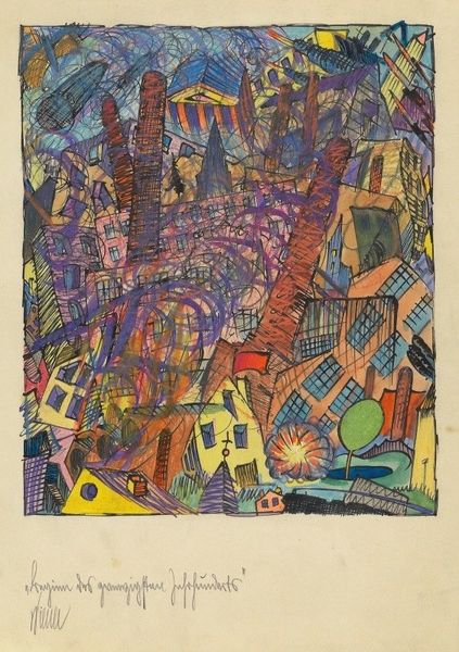
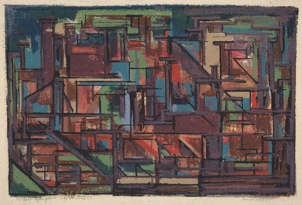
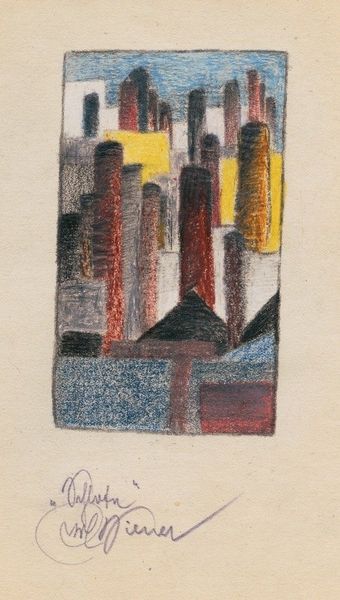
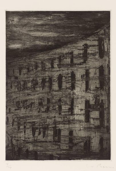
drawing, coloured-pencil, ink
#
drawing
#
coloured-pencil
#
ink
#
coloured pencil
#
geometric
#
expressionism
#
cityscape
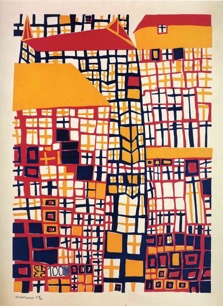
Copyright: Public Domain: Artvee
Curator: Let’s take a closer look at Karl Wiener’s, "Im Hotel zur Nachtigall," or "In the Hotel Nightingale," from around 1921, rendered with ink and colored pencil. It's quite a striking cityscape, isn't it? Editor: It certainly grabs your attention. It’s intensely melancholic, isn’t it? Each little compartment of this building shows shadowy figures—there is an odd voyeuristic feel about the piece. Curator: Voyeuristic indeed! Note how Wiener utilizes readily available materials like ink and colored pencils. These accessible mediums suggest an immediacy to the work, almost a sketch capturing a transient moment. It really speaks to the working conditions that shaped the artist's production and creative decisions. What do the boxlike divisions signify to you? Editor: Well, the squares could suggest a few things: the regimentation of urban life and architectural design that emphasizes confinement, alienation, and the feeling of being boxed in, or alternatively it recalls icons and stained glass windows where each panel holds its own fragment of narrative. But these fragments speak more of individual suffering and isolation than a divine narrative. Curator: Interesting. I’m struck by the construction—the cross-hatching employed for the facade, particularly the windows, is like a woven barrier. It seems almost intentionally distancing, highlighting the artificiality of viewing these intimate scenes. The labor-intensive process feels like a deliberate act of control, or perhaps an anxious rendering of modern experience. Editor: Right, the repeated forms suggest uniformity, which can reference the anonymity and depersonalization characteristic of modern urban spaces. But consider also how the specific color choices contribute. The pinks, greens, blues, even the vibrant yellow-orange of the sky, feel hallucinatory—lending this depiction of mundane urban life a dreamlike, even nightmarish quality. It makes you think about the psychological underpinnings of urban isolation, what one represses from one's conscious mind. Curator: Absolutely. We see an everyday setting—a building at twilight—transformed by the artist’s application of materials. It’s far from objective. This approach is consistent with Expressionism. The distortion, the heightened color—it all stems from a need to externalize interior states. It serves less as a visual record of a cityscape than it does a record of subjective experience within the city. Editor: It seems the hotel—a transient space by definition—becomes a vessel for shared solitude. In the figures sprawled in their rooms, you perceive the convergence of private inner worlds within this constructed space. Ultimately it presents a potent symbol for modernity's double-edged sword: connectivity and alienation. Curator: I think you're right. Seeing Wiener's work through the lens of materials and method illuminates how process and execution become central to decoding this seemingly simple, yet complex, expressionistic statement. Editor: And through symbols and color, we can trace an unspoken cultural memory within it, revealing how much emotional and psychological freight urban existence bears.
Comments
No comments
Be the first to comment and join the conversation on the ultimate creative platform.
More like this