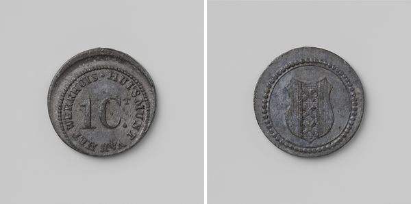
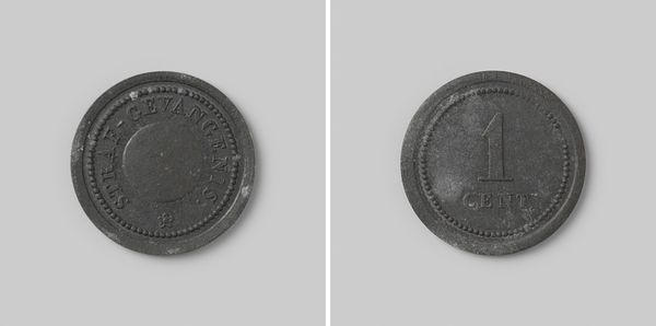
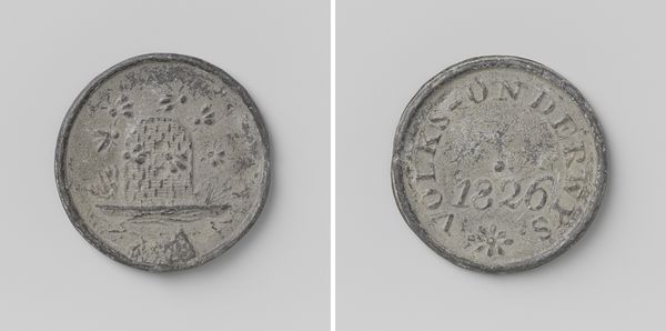
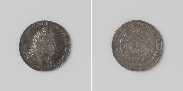
Betaalpenning voor Nederlandse strafgevangenissen, 50 cents gemerkt L (Leeuwarden) before 1861
0:00
0:00
print, metal
# print
#
metal
Dimensions: diameter 2.9 cm, weight 7.22 gr
Copyright: Rijks Museum: Open Domain
Editor: Here we have a Betaalpenning voor Nederlandse strafgevangenissen, or payment token for Dutch prisons, worth 50 cents. Made before 1861. It's…stark. Very simple in design. How might we interpret the artistry within it? Curator: One immediately notes the emphasis on circularity. Both the overall form and the beaded perimeter echo this. This repetition generates visual harmony and suggests self-containment. The metalwork exhibits signs of wear, which, ironically, contribute to the texture. Do you see how that wear introduces variance to an otherwise regulated design? Editor: I do. It disrupts the rigid composition and also emphasizes the token's age. I suppose it shows its utility. It's a used object, after all. Curator: Indeed. Function becomes integral to its aesthetic presence. Consider the typography: the numerals and lettering exhibit a clean, utilitarian sans-serif font. It eschews flourish. Editor: It seems purposefully devoid of any embellishment that might hint at beauty. There's even a letter "L" at the bottom, presumably indicating its origin in Leeuwarden. Curator: Precisely. Observe how the portrait, though somewhat indistinct, is contained within a central circle, further reinforcing the overall compositional concept. Its rigid simplicity demands we acknowledge its functional purity. This is about necessity, about the bare minimum needed for transactional recognition. Editor: So, instead of conveying political or social messaging like other coins, its artistic essence resides purely in its structure and unadorned materiality. Curator: An astute observation. Form and function coalesce, providing meaning enough. Editor: That is insightful, seeing value in how this art rejects conventional ideas of what beauty in art might be. Curator: Precisely. It’s an enriching lesson in considering the reductive, not just the decorative, in artistic interpretation.
Comments
No comments
Be the first to comment and join the conversation on the ultimate creative platform.
More like this