graphic-art, print, typography, poster
#
graphic-art
#
aged paper
#
art-nouveau
#
parchment
# print
#
old engraving style
#
wood background
#
tea stained
#
typography
#
wooden texture
#
warm-toned
#
golden font
#
decorative-art
#
poster
#
historical font
#
columned text
Copyright: Public domain
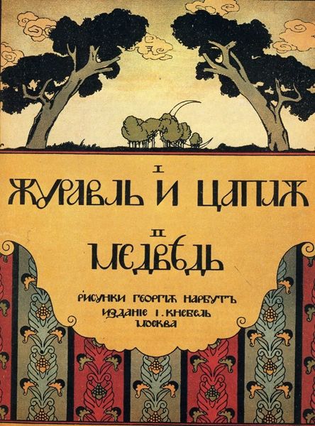
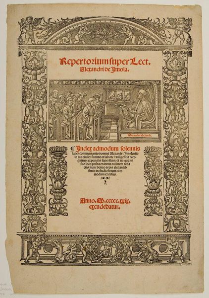
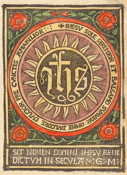
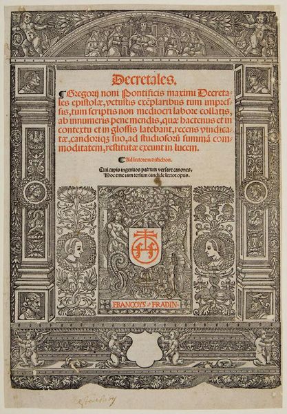
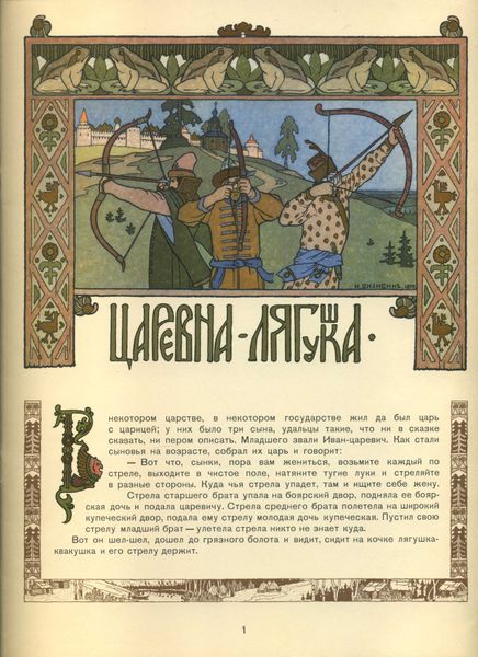
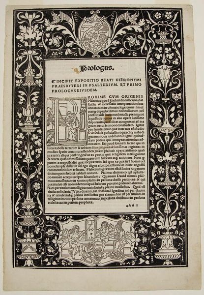
The cover of 'Wooden Eagle' was made by Heorhiy Narbut, but the exact date and materials used are unknown. Look at the way he works with color, how he uses a red, green and yellow palette in a restricted area. It gives the impression of Russian folk art, but also Art Nouveau and a dash of Japanese prints. Notice the columns on either side of the page, framing the title? They're so flat, so graphic, they feel like they're almost collapsing in on the words. Narbut’s touch is so deliberate, as if he’s carving the image into the surface. The precision and detail feel almost obsessive, but in a good way, like a mad scientist of design. Narbut's work reminds me a bit of Aubrey Beardsley, who had a similar interest in graphic art. Like Beardsley, Narbut embraced the decorative and ornamental, finding beauty in the details. Ultimately, it's this tension between simplicity and complexity that makes Narbut's 'Wooden Eagle' so intriguing.
Comments
No comments
Be the first to comment and join the conversation on the ultimate creative platform.
