graphic-art, typography, poster
#
graphic-art
#
art-nouveau
#
text
#
typography
#
decorative-art
#
poster
#
historical font
Copyright: Public domain
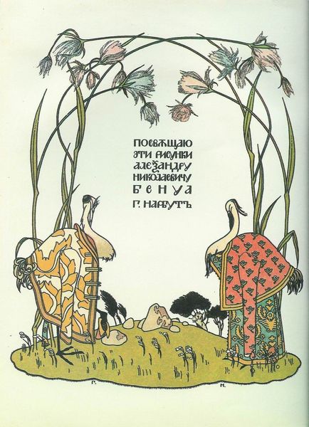
This is the cover for the book 'The crane and heron. Bear.' made by Heorhiy Narbut in the early 20th century. The limited palette of ochre, black, and muted reds gives the piece a kind of graphic punch, doesn’t it? Narbut uses color less for realism and more for impact, almost like a bold poster. Notice how the thick, dark lines define every shape, from the trees at the top to the ornate patterns at the bottom. It’s all about clarity and precision. Look closely at the trees. They’re not just trees; they’re graphic symbols, almost like characters in a play. There's a flattening of space, a reduction to essentials. Narbut reminds me of other early modernist illustrators like Aubrey Beardsley, in that he is interested in the book as a complete aesthetic object. Ultimately, what’s compelling here is the sense of a mind at work, simplifying and stylizing the world into something striking and new.
Comments
No comments
Be the first to comment and join the conversation on the ultimate creative platform.
More like this