drawing, ink
#
portrait
#
drawing
#
ink
#
calligraphy
Copyright: Rijks Museum: Open Domain
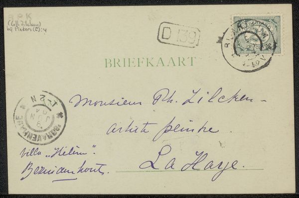
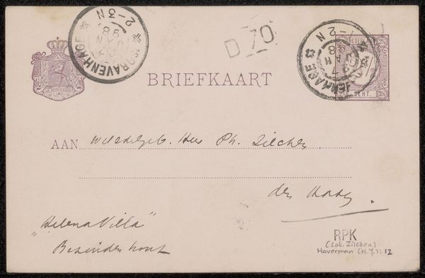
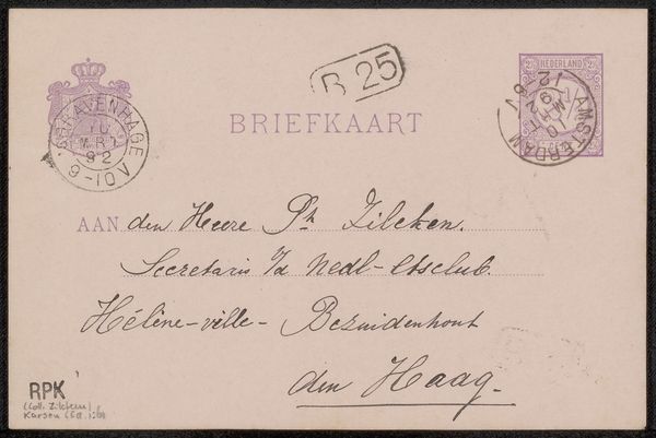
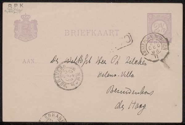
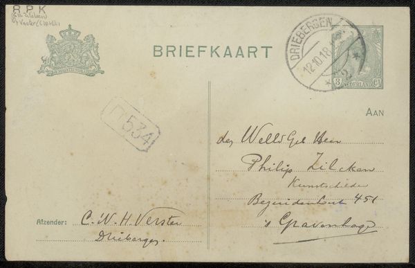
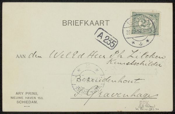
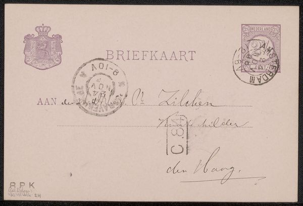
This is a postcard to Philip Zilcken by Thérèse Schwartze. Notice first how the composition is structured by the stark contrast between the ordered pre-printed text and the more chaotic handwriting. The printed elements are evenly spaced and horizontally aligned, providing a structured grid. This contrasts with the dynamic, freely written address, which cascades across the card. It is an assertion of the author’s individuality against the impersonal backdrop of mass communication. The stamps, with their circular and geometric designs, punctuate the corners, framing the handwritten message. We can read this through the lens of semiotics, where each element acts as a sign. The stamps signify official postal communication. The handwriting signals personal expression. The postcard, then, becomes a field where public and private intersect. Consider how Schwartze uses this format to engage in a dialogue between constraint and freedom, order and spontaneity. The postcard thus operates not merely as a means of conveyance, but as a dynamic interplay of signs, inviting us to contemplate the relationships between structure and expression.
Comments
No comments
Be the first to comment and join the conversation on the ultimate creative platform.
More like this