Copyright: Robert Goodnough,Fair Use
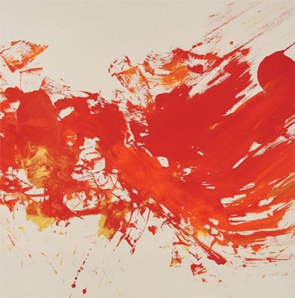
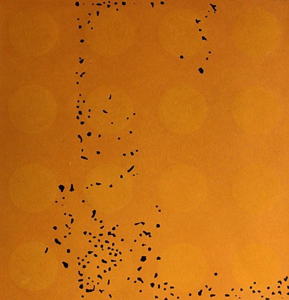
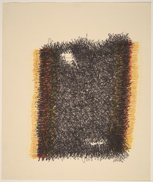
Curator: This is Robert Goodnough's "Orange" from 1973, rendered in acrylic on canvas with a definite impasto effect. What's your take? Editor: Striking how solitary this blot of orange seems against such a vast, empty field. The texture suggests an energetic application, almost a violent dabbing of color. I wonder about the material process. Curator: Indeed, the placement emphasizes isolation, but consider the color itself. Orange, a blend of red and yellow, embodies both passion and warmth, energy and optimism. It resonates across cultures as the color of sunrise, harvest, and fire – primal symbols of transformation and life. Editor: I'm curious about the repetitive, short strokes of paint – almost frantic. Is it an exploration of mark-making, of the physical act of applying pigment to surface? There’s an interesting contrast between the frenetic energy and the calm neutrality of the background. It also makes me think of the broader art market where paintings like this can become valuable commodities. Curator: The short strokes might recall the broken color of Impressionism, but here, they create an altogether different feeling, an agitated unity. We can consider Abstract Expressionism to have explored the sublime but then does Color Field take that expression further into a quieter and a contemplative zone? Editor: Perhaps the very sparseness is the point, demanding the viewer's focus not on representation, but on pure materiality and process. Look at how those stray grey marks extend the composition as a sort of intentional error. It almost feels like a quick study or preparatory sketch. Curator: These marks, along with the orange field, appear more as emanations, energy or feeling. They may resonate beyond the confines of their composition, hinting at larger emotional or symbolic constructs. The absence is also as significant as the color and presence in defining its impact. Editor: It really highlights the tension between chance and intention. We are left to consider just how deliberate, and what the implications of that choice might mean within the broader framework of modernism. Curator: Indeed. Perhaps this “Orange” is more than just a painting, and also stands as a potent emblem of elemental forces at play. Editor: Well said. It's definitely given me something to chew on, particularly thinking about its creation.
Comments
No comments
Be the first to comment and join the conversation on the ultimate creative platform.
More like this