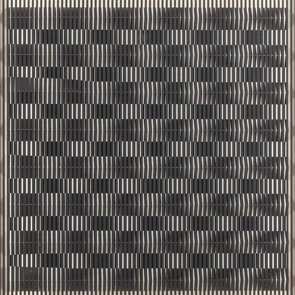
acrylic-paint
#
op-art
#
op art
#
acrylic-paint
#
form
#
geometric pattern
#
geometric
#
geometric-abstraction
#
line
#
hard-edge-painting
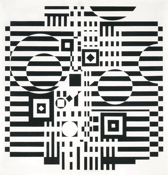
Copyright: Modern Artists: Artvee
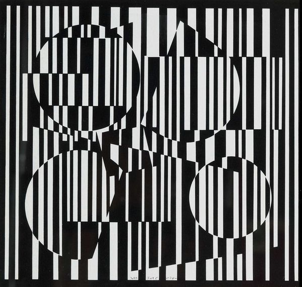
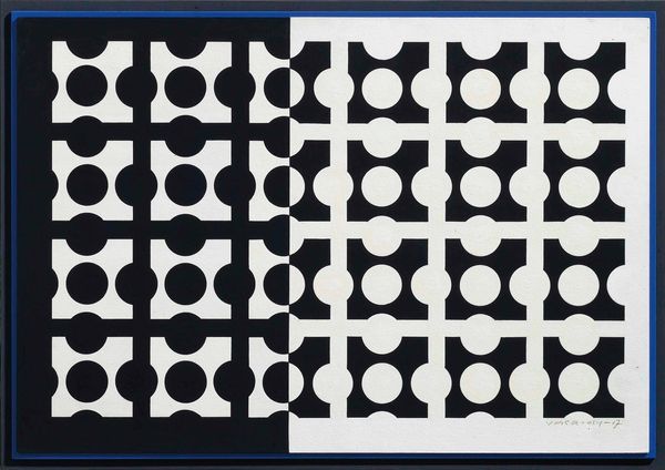
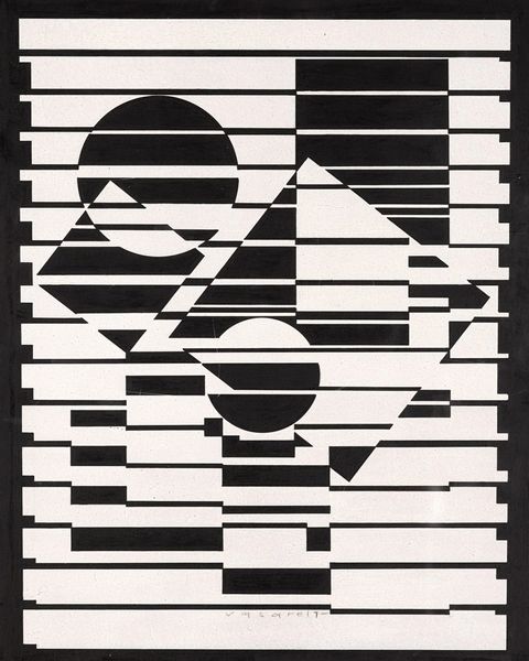
Curator: I see a kind of urban grid. Ovals and circles stutter across it, trapped or maybe emerging from the pattern. The stark black and white…it’s strangely unsettling, don’t you think? Editor: That tension is exactly what Victor Vasarely was after in "Iaca," a key work from his Op-Art period, made between 1957 and 1962 with acrylic. The black and white geometric forms seem simple, but their interaction creates visual vibrations. Curator: Visual vibrations! Precisely! It's like my eyeballs are doing yoga. What is this supposed to signify? Why does this feel…slightly oppressive, and what historical reading do you glean from it? Editor: Well, consider the era. The mid-century was full of anxieties, anxieties Vasarely seems to tap into by questioning perception itself. These precise geometric forms mimic industrialization, or even the digital world lurking just around the corner. The lack of color flattens depth and adds to the slightly cold, calculated feel. He believed in democratizing art with accessible, reproducible images – so, he made a statement available for mass production, in theory anyway. Curator: Democratizing anxiety, maybe! Although I concede, there's a rigorous, almost mathematical beauty in its construction, and some of the overlapping feels playful in the sense that one shape wants to break free or recede and yield to another. How is such tension achieved with purely geometric forms? Editor: That's the magic, right? Symbols often draw their strength from the visual field surrounding it. Vasarely manipulates the background stripes and overlaid circles and ovals so that our perception constantly recalibrates. It is more of an assault than a comforting, predictable representation. I might even associate its black and whiteness with something as elemental as "yin" and "yang". He wants the eye to constantly move, denying it any easy resting place. Curator: It is so true; an anti-icon of stability and status, rendered like a set of corporate logos in stylish tension, I would love to explore how it relates to space. Editor: Absolutely, and to continue pondering just how profoundly unsettling simplicity can be.
Comments
No comments
Be the first to comment and join the conversation on the ultimate creative platform.
More like this