drawing, graphic-art, print, paper, typography, ink
#
drawing
#
graphic-art
# print
#
paper
#
typography
#
ink
#
decorative-art
Dimensions: height 323 mm, width 200 mm
Copyright: Rijks Museum: Open Domain
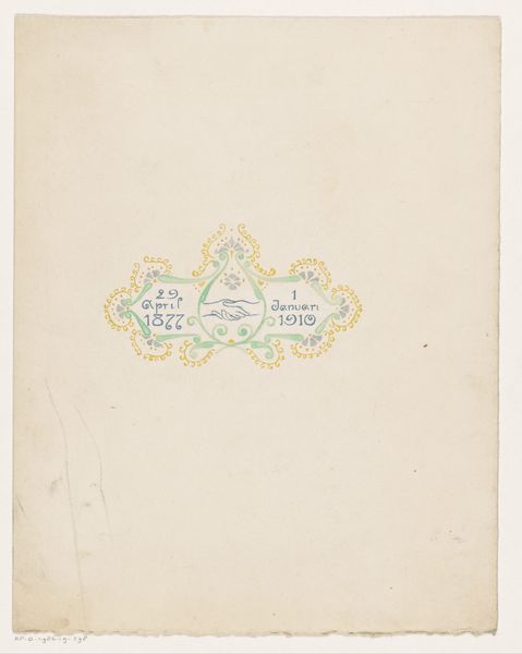
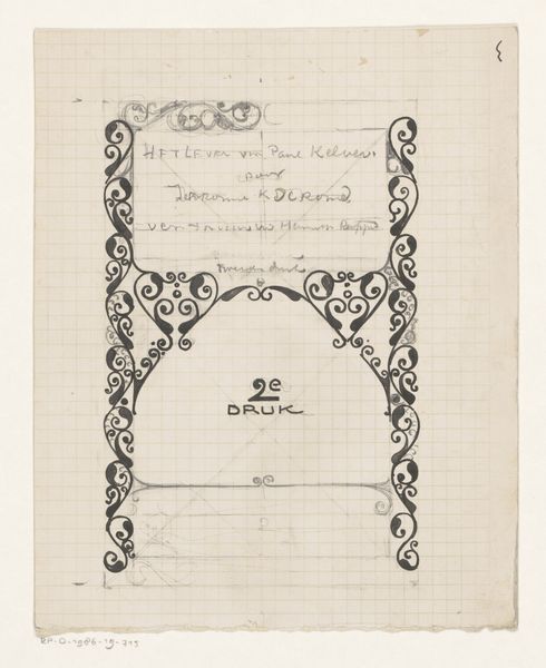
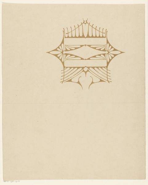
Curator: I find this print rather striking. It's entitled "Hoofdstuktitel met ornamenten en vignet," or "Chapter Title with Ornaments and Vignette," crafted by Reinier Willem Petrus de Vries in 1923. The ink on paper medium lends itself to the crisp detail in the typography and decorative elements. What's your initial read? Editor: My first impression is one of subtle tension. While the ornamentation and typography point towards classical design, the prominent spider vignette complicates it. There's something almost gothic or subversive lurking beneath the surface. Curator: Precisely. Observe how the decorative floral motifs intertwine with geometric lines to frame the text, which loosely translates to sketches in natural history. The artist's use of symmetry generates a sense of order, challenged only by that centrally positioned arachnid. Editor: That spider immediately positions the piece within a broader narrative of natural history's often unsettling engagement with the animal kingdom, and our persistent, often irrational, fear of invertebrates. I am led to ask how de Vries intended viewers to reconcile the decorative and perhaps even reassuring context with that specific element, which might trigger conflicting reactions, especially for interwar audiences. Curator: Interesting. Focusing strictly on formal composition, the spider mirrors and anchors the curvilinear flourishes above and below the inscription. In this context it isn't menacing, rather a compositional keystone. The artist guides the viewer's eye intentionally to observe not an aberration, but another component in the harmony of shapes. Editor: But can we ignore the creature’s historical significance as a symbol of manipulation and danger, its alignment with gendered notions of domesticity? It raises critical questions about human relationship to the natural world and assumptions of power. Curator: While that reading provides interesting context, it moves beyond the frame. The interplay of positive and negative space creates its own narrative within the structure of the image. Editor: It highlights that art possesses a formal identity and always participates within a cultural matrix—revealing that what is included is only part of its impact; the rest, by nature of what the symbol communicates, is cultural as well. Curator: Perhaps. Art finds equilibrium precisely in such diverse readings. Editor: Agreed. An equilibrium that invites sustained critical engagement.
Comments
No comments
Be the first to comment and join the conversation on the ultimate creative platform.
More like this