Copyright: CC0 1.0
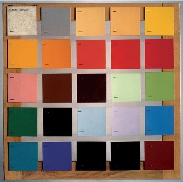
Editor: Here we have "Purple Madder," created by Charles Roberson and Co. It seems to be a vial of pigment. What strikes me is the contrast between the vibrancy of the colour chart and the muted, almost aged quality of the pigment itself. How would you approach interpreting this work? Curator: I focus primarily on the formal elements. Observe how the cylindrical glass interacts with the light, creating tonal shifts in the purple pigment. The composition of the image also presents a dialogue, the manufactured colour squares beside the manufactured pigment. Editor: That's a great point! It's all manufactured and arranged. I was focused on age, but you're right, it is arranged to create meaning. Curator: Exactly. The arrangement emphasizes a study of colour itself, and its production. Editor: Thank you. I see it differently now.
Comments
No comments
Be the first to comment and join the conversation on the ultimate creative platform.
